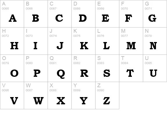
In the vast landscape of typography, certain fonts stand out for their enduring appeal and versatility. Bookman Old Style Bold, a robust serif typeface, is undoubtedly one of them. Its strong presence and classic feel make it a popular choice for a wide range of applications, from book covers and headlines to body text and branding.
This typeface evokes a sense of tradition and authority, while its boldness adds a touch of sophistication and impact. But what is it about Bookman Old Style Bold that continues to resonate with designers and readers alike? This article delves into the history, characteristics, and practical applications of this timeless font, exploring its strengths and weaknesses, and offering insights into how to use it effectively.
Bookman Old Style, the parent typeface of the bold variant, has a rich history dating back to the late 19th century. Its origins lie in the designs of Alexander Phemister, a Scottish punchcutter. The bold version emerged later, offering a more impactful variation for headlines and display purposes. Its robust serifs and distinct letterforms contribute to its legibility and enduring popularity.
The bold weight of Bookman adds a significant layer of visual interest to any text. It allows for clear differentiation and emphasis, making it suitable for titles, headings, and other elements that require prominence. The inherent elegance of the original Bookman design is amplified in the bold version, offering a balance of strength and refinement.
Understanding the historical context of Bookman Old Style Bold provides insight into its aesthetic qualities and enduring appeal. This typeface has weathered the changing trends in typography, remaining a relevant choice for both traditional and contemporary designs. Its versatility and readability have contributed to its continued use across various media.
The impact of using a heavier weight like Bookman Old Style Bold can dramatically alter the visual tone of a design. While it offers advantages in terms of readability and impact, it's essential to use it judiciously. Overuse can lead to a visually overwhelming experience for the reader.
One benefit of Bookman Old Style Bold is its legibility, even at smaller sizes. The distinct serifs and well-defined letterforms contribute to its clarity, making it a suitable choice for body text in certain contexts. Another benefit is its classic aesthetic. This typeface conveys a sense of timelessness and authority, making it a good fit for formal documents, academic publications, and traditional branding.
A third benefit is its versatility. While often used for headings and titles, Bookman Old Style Bold can also be effectively used for body text in shorter passages, captions, and other design elements where a strong and readable typeface is required.
Advantages and Disadvantages of Bookman Old Style Bold
| Advantages | Disadvantages |
|---|---|
| Legible at various sizes | Can appear overwhelming if overused |
| Classic and timeless aesthetic | May not be suitable for all modern designs |
| Versatile for various applications | Limited availability of weights and styles compared to other font families |
Best practices for using Bookman Old Style Bold include considering the context and audience, pairing it with complementary fonts, and using it sparingly for maximum impact.
FAQ:
1. Is Bookman Old Style Bold a web-safe font? Generally, no. It often needs to be embedded or a similar font substituted.
2. Where can I obtain Bookman Old Style Bold? It is often included with software packages or can be purchased from font foundries.
3. Is Bookman Old Style Bold suitable for logos? It can be, particularly for brands seeking a classic and established feel.
4. What are some good font pairings with Bookman Old Style Bold? Consider pairing it with sans-serif fonts like Helvetica or Arial for contrast.
5. Can Bookman Old Style Bold be used for long-form text? While legible, its boldness can be tiring for extended reading.
6. How can I ensure Bookman Old Style Bold displays correctly on different devices? Proper embedding or web font usage is essential.
7. What are some alternatives to Bookman Old Style Bold? Consider Georgia, Times New Roman, or Palatino.
8. Is Bookman Old Style Bold suitable for print publications? Yes, it is well-suited for print due to its excellent readability.
In conclusion, Bookman Old Style Bold remains a relevant and impactful typeface for a wide array of design projects. Its historical significance, distinctive characteristics, and versatility make it a valuable tool for designers and publishers seeking a classic and readable font. While its boldness requires careful implementation, when used effectively, Bookman Old Style Bold can elevate any design with its timeless elegance and powerful presence. Consider incorporating this classic typeface into your next project and experience the enduring appeal of Bookman Old Style Bold.
Deathly stylish unpacking the peverell coat of arms in harry potter
Why is li shang not in mulan the controversy explained
Acc championship game your burning questions answered
Bookman Old Style Bold Font - Khao Tick On
Bookman Bold Condensed Agency Font Download - Khao Tick On
Download free Bookman Old Style Bold font free BOOKMOSBttf Regular - Khao Tick On
Bookman Old Style Bold Windows font - Khao Tick On
Bookman Old Style Bold T Font - Khao Tick On
Bookman Old Style Bold Italic free font download - Khao Tick On
Bookman Old Style Regular Download For Free View Sample Text Rating - Khao Tick On
Bookman Old Style Bold Font - Khao Tick On
Bookman Old Style Bold truetype font - Khao Tick On
Download free Bookman Old Style Bold font free BOOKMOSBttf Regular - Khao Tick On
Bookman Font Free Download - Khao Tick On
Bookman Old Style Bold Font - Khao Tick On
bookman old style bold font - Khao Tick On
Bookman Old Style Bold Font - Khao Tick On
Bookman Old Style Bold Font by Charlieaat on DeviantArt - Khao Tick On


