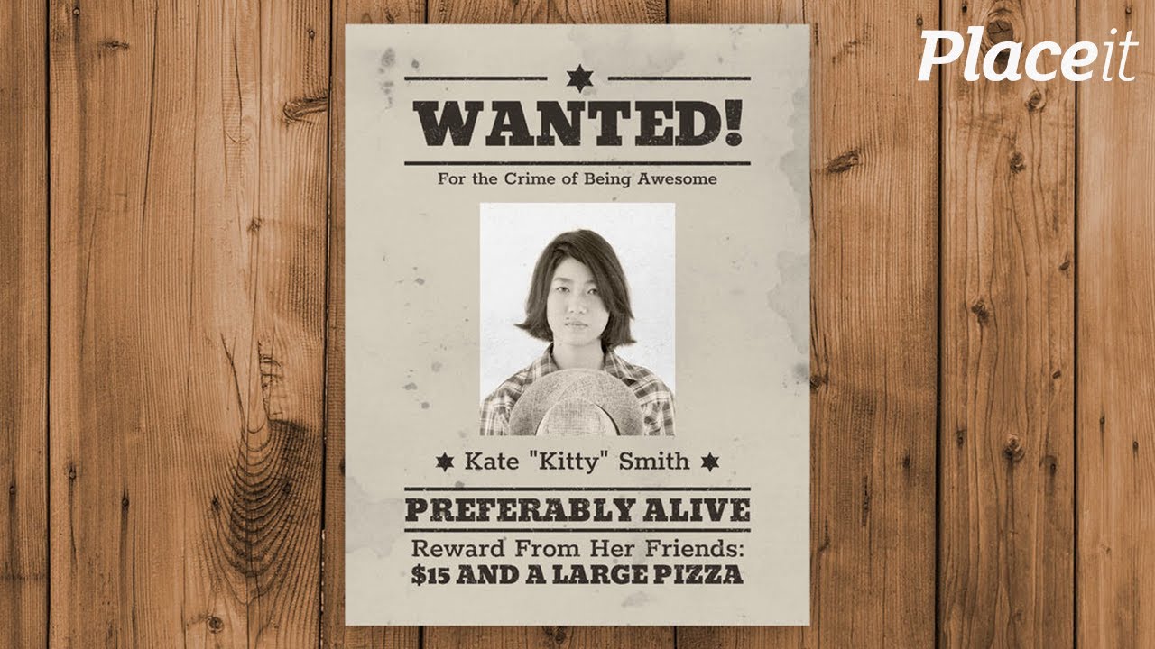
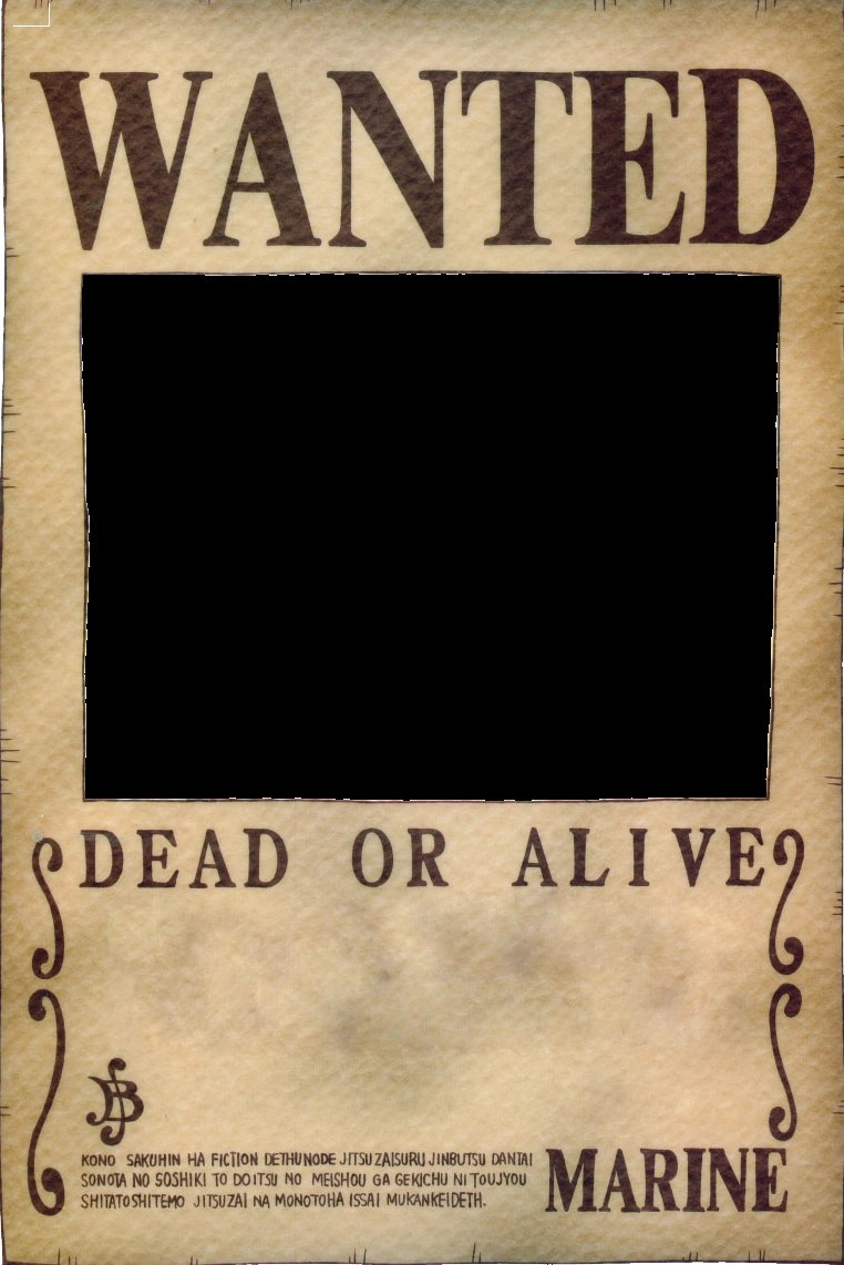
Imagine a dusty saloon in the Wild West. A tattered wanted poster hangs precariously, its bold, eye-catching typeface instantly communicating danger and intrigue. The right font can transform a simple poster into a powerful statement. This comprehensive guide delves into the art of choosing the perfect wanted poster font, exploring its history, best practices, and how to achieve that authentic, captivating look.
Choosing the appropriate typeface for a wanted poster goes beyond mere aesthetics. It’s about capturing a specific era, evoking a particular mood, and ultimately, grabbing the viewer's attention. Whether you're designing a poster for a school play, a party invitation, or a graphic design project, understanding the nuances of wanted poster fonts can elevate your work to a new level.
The "wanted poster" aesthetic draws heavily from the American Wild West era. Think serif typefaces, often with a distressed or eroded look, reminiscent of old printing presses and weathered paper. These fonts convey a sense of history, lawlessness, and adventure, making them perfect for capturing the spirit of the Wild West. But the influence of these iconic fonts extends far beyond historical recreations. They've permeated popular culture, appearing in everything from movie posters to video game titles, demonstrating their enduring appeal and versatility.
Finding the ideal wanted poster font involves considering several factors. The tone of your project is paramount. A comedic poster might call for a more playful, exaggerated typeface, while a serious or dramatic design might benefit from a more classic, rugged font. Readability is also crucial. While a highly stylized font might look appealing, ensure the text remains legible, especially from a distance. Balancing aesthetics with practicality is key to effective design.
Beyond the Wild West, wanted poster fonts have evolved and diversified. Modern interpretations often incorporate elements of grunge, vintage, and even art deco styles, offering a wider range of options for designers. This evolution reflects the enduring fascination with the wanted poster as a visual communication tool, constantly being reimagined and adapted for contemporary use.
A few popular choices for achieving that authentic wanted poster look include fonts like "Deadwood," "Playbill," and "Old London." These fonts typically feature thick, bold serifs, often with decorative elements that contribute to their vintage charm. Experimenting with different fonts and incorporating distressing effects can further enhance the authenticity of your design.
Three key benefits of using an effective wanted poster font are: 1) Enhanced visual impact: A well-chosen font instantly grabs attention, communicating the poster's purpose effectively. For example, a bold, distressed font immediately signals a Wild West theme. 2) Setting the mood: The font can evoke specific emotions and associations. A more playful font creates a lighthearted atmosphere, while a rugged font enhances a sense of drama. 3) Increased authenticity: Using a historically accurate font adds credibility and depth to your design, immersing the viewer in the chosen theme.
Advantages and Disadvantages of Wanted Poster Fonts
| Advantages | Disadvantages |
|---|---|
| Visually striking and attention-grabbing | Can be difficult to read at small sizes |
| Evokes a sense of history and nostalgia | May not be suitable for all project types |
| Versatile and adaptable to different design styles | Overuse can make a design feel cliché |
Five best practices for implementing wanted poster fonts:
1. Consider the context: Match the font to the overall tone and theme of your project.
2. Prioritize readability: Ensure the text is easily legible, even from a distance.
3. Experiment with distressing effects: Add a touch of grunge or weathering to enhance the vintage feel.
4. Balance aesthetics with practicality: Choose a font that is both visually appealing and functional.
5. Test different options: Explore various fonts and styles to find the perfect fit for your design.
Frequently Asked Questions:
1. Where can I find free wanted poster fonts? Answer: Many websites offer free fonts for download.
2. Can I use these fonts for commercial projects? Answer: Check the licensing terms for each font.
3. How can I add distressing effects to my font? Answer: Graphic design software offers various tools and techniques.
4. What other design elements complement wanted poster fonts? Answer: Consider using vintage textures, illustrations, and color palettes.
5. Are there modern interpretations of wanted poster fonts? Answer: Yes, many contemporary fonts draw inspiration from the classic style.
6. What are some alternative font choices for a similar effect? Answer: Explore vintage, grunge, and western-themed fonts.
7. How can I ensure my wanted poster font is readable? Answer: Test different sizes and styles to optimize legibility.
8. What are some common mistakes to avoid when using these fonts? Answer: Avoid overusing distressing effects and ensure the font complements the overall design.
Tips and tricks: When designing your wanted poster, consider using a contrasting background color to enhance readability. Experiment with different font sizes and kerning (the spacing between letters) to achieve the desired visual impact. Adding a subtle drop shadow can also improve legibility and add depth to the text.
In conclusion, choosing the right wanted poster font is a critical aspect of effective design. From capturing the spirit of the Wild West to creating a striking visual statement, the perfect font can elevate your project and communicate your message with impact. By understanding the history, best practices, and diverse range of available fonts, you can unlock the power of typography and create captivating designs that resonate with your audience. Remember to consider your project's specific needs, prioritize readability, and experiment with different options to find the font that perfectly embodies your vision. Start exploring the world of wanted poster fonts today and unleash your creativity! Embrace the rich history and visual appeal of these unique typefaces and transform your designs into captivating works of art. Don't just settle for ordinary – capture attention with the perfect wanted poster font.
Decoding the federal salary landscape virginia beach va
Vi peel transformations unveiling the before after
Its friday funny cat message a pawsitive way to end the week
One Piece Wanted Poster Font Generator - Khao Tick On
best wanted poster font - Khao Tick On
Western Wanted Poster Font - Khao Tick On
Banned Books Wanted Posters - Khao Tick On
Character Wanted Poster Printable Template - Khao Tick On
Blank Wanted Poster Template - Khao Tick On
Wanted Poster Word Template - Khao Tick On
1920x1080px 1080P free download - Khao Tick On
Wanted Poster Font Cowboy Western Font Ttf Svg Eps - Khao Tick On
best wanted poster font - Khao Tick On
best wanted poster font - Khao Tick On
One Piece Bounty Poster Template - Khao Tick On
Sample Wanted Poster Template - Khao Tick On
Western Wanted Poster Template Free Download - Khao Tick On
One Piece Oc Template - Khao Tick On


:max_bytes(150000):strip_icc()/GettyImages-165931367-5c06d207c9e77c0001ee02ef.jpg)


