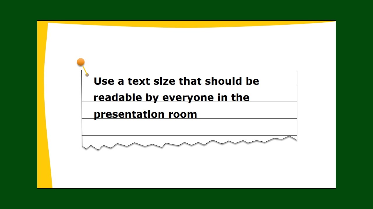
Ever found yourself squinting at a presentation, struggling to decipher the tiny text on a distant screen? Or perhaps you've been bombarded by giant, overwhelming words that feel more like a shout than a message? The struggle is real. Choosing the right PowerPoint font size can make or break your presentation's impact. Let's dive into the world of typography and unlock the secrets to perfectly sized text.
Picking the correct dimensions for your text is more than just aesthetics; it's about communication. Your font size directly impacts readability, audience engagement, and the overall professionalism of your presentation. Too small, and your audience will be lost. Too large, and it becomes distracting. Finding that sweet spot is crucial for delivering a successful presentation.
Historically, presentations were often limited by technology and projector quality, impacting font choices. However, with today's high-resolution displays, we have more flexibility. Yet, the core principle remains: clarity. The importance of appropriate font sizes stems from the need to ensure your message reaches everyone in the room, regardless of their seating position.
One of the biggest issues related to PowerPoint font sizes is inconsistency. Varying sizes across different slides can create a disjointed and unprofessional feel. Another common mistake is neglecting the viewing distance. A font size that looks perfect on your laptop screen might be illegible when projected in a large room. Understanding these challenges is the first step toward crafting visually appealing and effective presentations.
Generally, a good rule of thumb for body text is to stay within the 24-32 point range. Titles should be significantly larger, typically between 40-60 points, to create a clear visual hierarchy. Subheadings can fall somewhere in between, around 30-40 points. These are just guidelines, however, and you may need to adjust based on your specific font, presentation content, and room size.
A well-chosen font size offers several benefits. Firstly, it enhances readability, making it easier for your audience to absorb information. Secondly, it improves audience engagement by preventing frustration and allowing them to focus on your message. Finally, it boosts the overall professionalism of your presentation, conveying a sense of polish and attention to detail.
Creating an effective presentation involves careful planning. Start by choosing a clear and easy-to-read font. Then, determine the appropriate sizes for titles, subtitles, and body text, keeping in mind the viewing distance. Test your presentation on a projector to ensure optimal readability from the back of the room.
Advantages and Disadvantages of Different Font Sizes
| Font Size | Advantages | Disadvantages |
|---|---|---|
| Too Small | Can fit more text on a slide | Difficult to read, strains audience's eyes |
| Too Large | Easy to read from a distance | Can feel overwhelming, limits text per slide |
| Just Right | Easy to read, professional appearance | Requires careful planning and testing |
Best Practice 1: Maintain consistency throughout your presentation.
Best Practice 2: Consider the viewing distance.
Best Practice 3: Choose a clear and legible font.
Best Practice 4: Test your presentation on a projector.
Best Practice 5: Use visual hierarchy effectively.
FAQ 1: What is the best font size for PowerPoint titles? Generally, 40-60 points.
FAQ 2: What is the best font size for PowerPoint body text? Usually, 24-32 points.
FAQ 3: How do I choose the right font size?
Consider your font, content, and viewing distance.
FAQ 4: Should I use the same font size for all text?
No, vary sizes for titles, subtitles, and body text.
FAQ 5: What are some good fonts for presentations? Arial, Calibri, Helvetica, etc.
FAQ 6: How can I test my font size?
Project your presentation and view it from a distance.
FAQ 7: What if my text doesn't fit on the slide?
Reduce font size or edit content.
FAQ 8: Why is font size important?
It impacts readability and audience engagement.
In conclusion, selecting the appropriate PowerPoint font size is a crucial aspect of creating effective and engaging presentations. From ensuring readability to enhancing professionalism, the right font size can significantly impact how your message is received. By following the guidelines and best practices outlined in this article, you can ensure your presentations are visually appealing, easy to follow, and leave a lasting impression on your audience. Remember to consider your specific context, test your slides, and always prioritize clarity. Start optimizing your presentations today and watch your audience engagement soar.
Who penned mulans heroism unmasking the storys origins
The delightful universe of funny gacha memes clean a celebration of wholesome humor
Honda ridgeline redesign speculation and buyers guide
best font size for ppt presentation - Khao Tick On
Best fonts for powerpoint presentations - Khao Tick On
best font size for ppt presentation - Khao Tick On
Best font sizes for powerpoint presentation - Khao Tick On
Memilih Font Terbaik untuk PowerPoint 10 Tips Contoh - Khao Tick On
Change font size in powerpoint for mac - Khao Tick On
Best font size for powerpoint presentation 2022 - Khao Tick On
best font size for ppt presentation - Khao Tick On
Best font for writing thank you on powerpoint presentation - Khao Tick On
best font size for ppt presentation - Khao Tick On
How Many Fonts Should I Include in My PowerPoint - Khao Tick On
Best font for presentation powerpoint - Khao Tick On
Best font size for presentation powerpoint - Khao Tick On
Some Data on the Current Use of PowerPoint - Khao Tick On
Best font size for presentation powerpoint - Khao Tick On


