Have you ever picked up a report and felt instantly overwhelmed, not by the content, but by the formatting? The size of your headings plays a crucial role in how a reader perceives and digests information. Choosing the right heading font size can be the difference between a clear, professional document and a chaotic, amateurish one. Let's delve into the nuances of selecting the perfect font size for your report headings.
Imagine a symphony orchestra. The conductor uses varying dynamics to guide the listener through the piece. Similarly, heading sizes act as visual cues, signaling the hierarchy of information. Too large, and the headings scream for attention, overwhelming the reader. Too small, and they blend into the body text, leaving the reader lost in a sea of words. The right size strikes a balance, creating a harmonious flow of information.
Effective heading sizes are more than just aesthetics; they're about usability. They guide the reader's eye, allowing them to quickly scan the document and grasp the main points. This is particularly important in lengthy reports where readers often skim for specific information. Choosing appropriate heading font sizes facilitates this process, enhancing the overall reading experience.
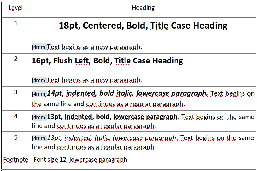
While there's no one-size-fits-all answer to the "perfect" heading size, generally accepted practices suggest a hierarchical approach. The main heading (typically level 1) should be the largest, followed by progressively smaller sizes for subsequent levels (level 2, level 3, etc.). This creates a visual hierarchy that mirrors the logical structure of the report.
The specific font sizes you choose will depend on various factors, including the font family, the overall document length, and the intended audience. However, a common practice is to use a font size of 16-20 points for the main heading, 14-16 points for level 2 headings, and 12-14 points for level 3 headings. This provides a clear visual distinction while maintaining a cohesive look.
The history of standardized typography stretches back centuries, evolving alongside printing technology. Early printers experimented with different font sizes and styles, laying the groundwork for the conventions we use today. The advent of digital publishing further refined these conventions, leading to a greater emphasis on readability and accessibility.
One key issue related to heading sizes is consistency. Inconsistent heading sizes can confuse the reader and disrupt the flow of the document. Maintain a consistent size for each heading level throughout your report to ensure a professional and organized appearance.
Advantages and Disadvantages of Standardized Heading Font Sizes
| Advantages | Disadvantages |
|---|---|
| Improved readability | Can feel restrictive in creative contexts |
| Professional appearance | May not be suitable for all document types |
| Enhanced navigation | Requires careful planning and implementation |
Best Practices for Implementing Standard Heading Font Sizes:
1. Maintain Hierarchy: Use a larger font size for higher-level headings and progressively smaller sizes for lower levels.
2. Consider Font Family: Different fonts have different visual weights. Adjust sizes accordingly.
3. Test Readability: View your document at different zoom levels to ensure headings are clear and legible.
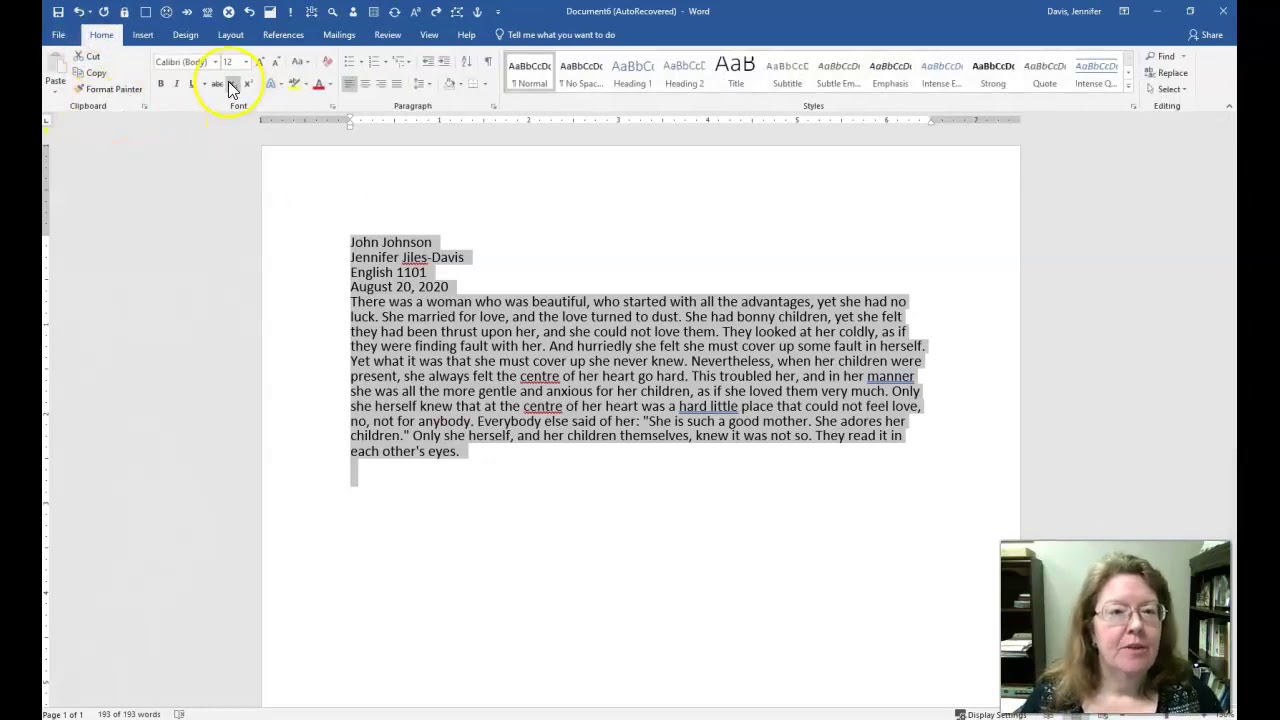
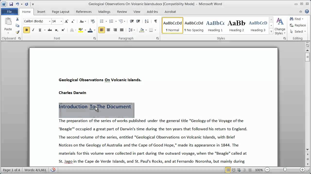
4. Use Styles: Utilize style guides and templates to ensure consistency across documents.
5. Seek Feedback: Ask colleagues or peers to review your document for readability.
FAQ:
1. What is a good standard font size for a main heading? - 16-20 points
2. Should I use the same font for headings and body text? - Not necessarily, but they should complement each other.
3. How can I ensure consistent heading sizes in my report? - Use style guides and templates.
4. What are the benefits of using standard heading sizes? - Improved readability, professional appearance, and enhanced navigation.
5. Are there any disadvantages to using standard heading sizes? - Can feel restrictive in certain contexts.
6. What factors should I consider when choosing heading sizes? - Font family, document length, and target audience.
7. How can I test the readability of my headings? - View the document at different zoom levels.
8. What tools can I use to manage heading styles? - Word processing software typically includes style management features.
Tips and Tricks:
Experiment with different font sizes and styles to find what works best for your specific needs. Don't be afraid to break the rules occasionally, but always prioritize readability and clarity.
In conclusion, choosing the right font size for report headings is a crucial step in creating a professional, readable, and engaging document. By understanding the principles of visual hierarchy and following best practices, you can guide your readers through your report with ease, ensuring that your message is clearly communicated. Implementing consistent and appropriate heading sizes enhances the overall reading experience, allowing your content to shine. Take the time to experiment, test, and refine your formatting choices, and your readers will thank you for it. Remember, clear communication is the cornerstone of effective reporting, and choosing the right heading font size is a small but significant step towards achieving that goal.
Unlocking serenity exploring the blue green color palette
Unearthing putnam ct a look at newspaper obituaries and local history
Designing with wild west flair wanted poster fonts
standard font size for report headings - Khao Tick On
standard font size for report headings - Khao Tick On
Formal Report Font Size at Elda Strain blog - Khao Tick On
standard font size for report headings - Khao Tick On
Lab Report Template PDF Templates Jotform 53 OFF - Khao Tick On
What are headings in APA - Khao Tick On
maorí Picotear puente times new roman font 12 Repegar claro Frontera - Khao Tick On
standard font size for report headings - Khao Tick On
Apa reference essay Reference List Basic Rules 2022 - Khao Tick On
Create headings in microsoft word - Khao Tick On
How To Make Headings In Microsoft Word - Khao Tick On
standard font size for report headings - Khao Tick On
How to Use Style sheets in Microsoft Word to help improve your writing - Khao Tick On
standard font size for report headings - Khao Tick On
standard font size for report headings - Khao Tick On


