Ever wondered why some reports are a breeze to read while others feel like a slog? The answer often lies in something as seemingly simple as font size. Choosing the right font size for your reports is crucial for ensuring readability, conveying professionalism, and making a positive impression on your audience.
Selecting an appropriate font size contributes significantly to the overall effectiveness of your report. Too small, and your readers will strain their eyes, potentially missing key information. Too large, and the report can appear unprofessional and childish. Finding that Goldilocks "just right" size is essential for maximizing impact.
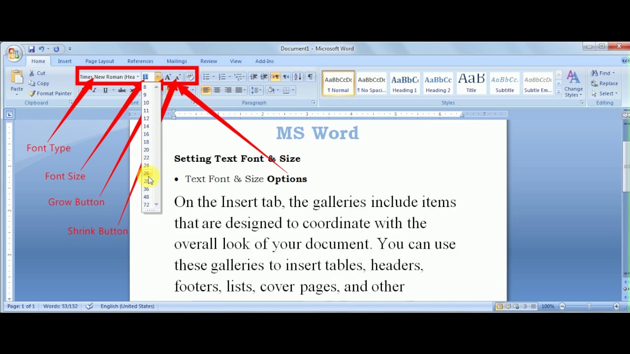
While there isn't a universally mandated "standard font size for reports," a general consensus points to 12-point as the preferred choice for body text. This size offers a comfortable reading experience for most individuals and works well across various platforms and devices. However, context is always key – factors like font type, report length, and target audience can influence the optimal size.
Historically, font size standardization in printed materials arose with the advent of printing presses and the subsequent need for consistency. In the digital age, maintaining a standard font size ensures readability across diverse devices and screens. This consistency enhances professionalism, making documents easier to digest and comprehend regardless of the viewing medium.
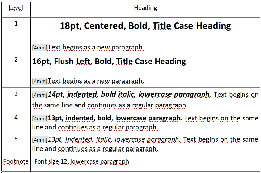
The main issues related to incorrect font sizes in reports center around readability and accessibility. An inappropriately small font size can make reading difficult, especially for those with visual impairments. Conversely, excessively large fonts can disrupt the flow of text and make the report look amateurish. Therefore, understanding suitable font sizes for different report sections, such as headings, subheadings, and body text, is critical.
A recommended font size for report headings is typically 14-16 points, allowing them to stand out while maintaining balance with the body text. Subheadings can range from 12-14 points, creating a clear visual hierarchy within the document. Using slightly larger fonts for headings and subheadings helps guide the reader's eye through the report and enhances overall organization.
Benefits of using a standard font size for report writing include improved readability, enhanced professionalism, and increased accessibility. Readability is paramount, as it ensures the information is easily consumed and understood. Professionalism is boosted through a consistent and polished presentation. Accessibility is improved, making the report accessible to a wider range of readers, including those with visual impairments.
An action plan for selecting the optimal font size begins with considering the report's purpose and audience. Next, choose a clear and readable font type, such as Times New Roman, Arial, or Calibri. Experiment with different font sizes, printing sample pages to assess readability. Finally, solicit feedback from others to ensure the chosen size is comfortable and effective.
Advantages and Disadvantages of Standard Font Sizes
| Advantages | Disadvantages |
|---|---|
| Improved readability | Can be inflexible for certain design needs |
| Enhanced professionalism | May not cater to all audiences (e.g., visually impaired) |
| Increased accessibility | Might appear monotonous if not used creatively |
Best practices for implementing standard font sizes include maintaining consistency throughout the document, using appropriate sizes for different sections (headings, subheadings, body text), choosing clear and readable fonts, testing readability across different devices, and soliciting feedback. Real-world examples include academic papers, business reports, government documents, and scientific publications, all typically adhering to standard font size conventions.
Common challenges include catering to visually impaired readers and maintaining visual appeal while adhering to standards. Solutions involve offering alternative formats, such as large print or audio versions, and incorporating visual elements strategically to enhance engagement without compromising readability.
Frequently asked questions often revolve around recommended font sizes, suitable fonts for reports, adjusting font sizes for different audiences, and balancing aesthetics with accessibility. Tips and tricks include using white space effectively, breaking up large blocks of text, and using visual aids to improve readability.
In conclusion, choosing the right font size for your reports is a critical aspect of effective communication. It directly impacts readability, professionalism, and accessibility. By adhering to best practices and considering your target audience, you can ensure your reports are clear, engaging, and leave a lasting positive impression. While 12-point font is generally recommended, remember to consider context and specific needs when making your final decision. The goal is to create a visually appealing and easy-to-read document that effectively conveys your message. Take the time to experiment, solicit feedback, and refine your approach to optimize your reports for maximum impact and create a truly engaging reading experience for your audience. Don't underestimate the power of the right font size – it can make all the difference in how your report is received and understood.
Santa muerte tattoos symbolism unveiling the deeper meanings
Escape to clewiston florida your perfect vacation rental awaits
Unleash your inner architect pictures for home building tips that actually work
Font and size for research paper - Khao Tick On
standard font size for report writing - Khao Tick On
Printable Font Size Chart - Khao Tick On
Size Of Wallet Size Photo In Microsoft Word STRONGER - Khao Tick On
standard font size for report writing - Khao Tick On
standard font size for report writing - Khao Tick On
Recommended font size based on previous research results - Khao Tick On
Presentation font size Dos and donts - Khao Tick On
Configure Font Size in the Word Report That Generated by MS Office - Khao Tick On
standard font size for report writing - Khao Tick On
standard font size for report writing - Khao Tick On
PDF readable font size for a4 PDF Télécharger Download - Khao Tick On
standard font size for report writing - Khao Tick On
PDF Télécharger apa headings and subheadings font size Gratuit PDF - Khao Tick On
Format For Font Size - Khao Tick On


