Imagine a perfectly tailored suit – crisp lines, balanced proportions, every detail meticulously considered. Academic writing, particularly in APA 7th edition, demands a similar level of precision. It's not just about what you say, but how you present it. This brings us to the seemingly subtle, yet incredibly important, elements of APA 7th edition: font, spacing, and the overall style they create.
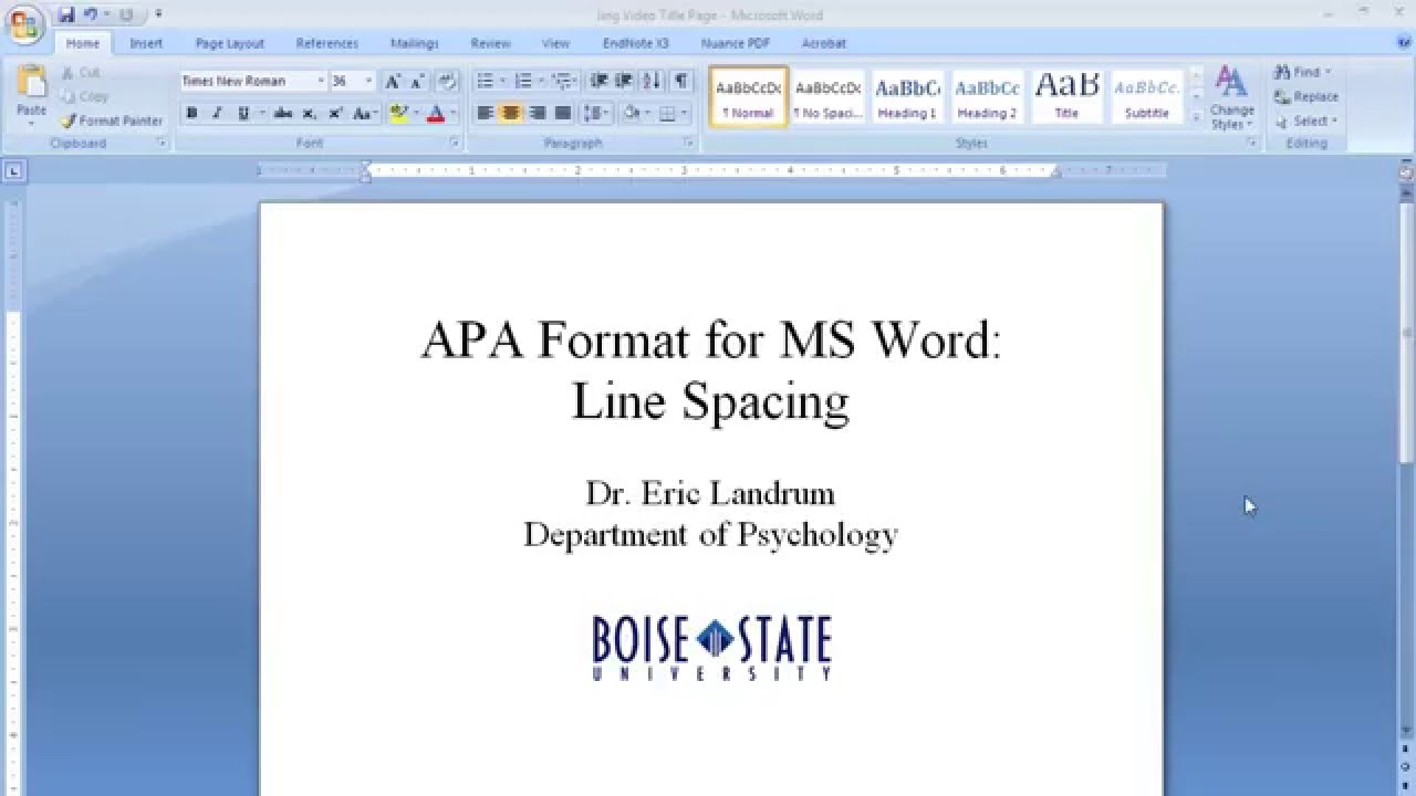
APA 7th edition formatting, specifically its font and spacing guidelines, acts as the foundational framework upon which scholarly work is built. Just as a well-chosen font enhances readability in a fashion magazine, the right typeface in academic writing contributes to clarity and professionalism. Consistent double-spacing throughout your document, akin to the balanced proportions of a well-tailored garment, ensures a smooth, uninterrupted flow of ideas.
The APA style guidelines, now in their seventh edition, emerged from a 1929 meeting of psychologists, anthropologists, and business managers seeking to standardize scientific writing. These guidelines, focused on clear communication and consistent presentation, have evolved over the decades to accommodate the changing landscape of scholarly publishing, including the rise of digital media. The emphasis on specific fonts and spacing stems from the need to create universally accessible and readable documents.
Choosing an appropriate font and adhering to specific spacing rules is crucial for several reasons. It enhances readability, making your work more accessible to a wider audience, including those with visual impairments. It projects professionalism, demonstrating your attention to detail and adherence to academic conventions. And, importantly, it ensures that your ideas are presented clearly and without distraction, allowing your research to shine.
A key element of APA 7th edition formatting is the requirement for a clear, readable typeface. Acceptable fonts include Times New Roman (12pt), Calibri (11pt), Arial (11pt), Georgia (11pt), and Lucida Sans Unicode (10pt). The specific point sizes ensure optimal readability both on screen and in print. Consistent use of one of these fonts throughout your document is essential for maintaining a professional and cohesive appearance.
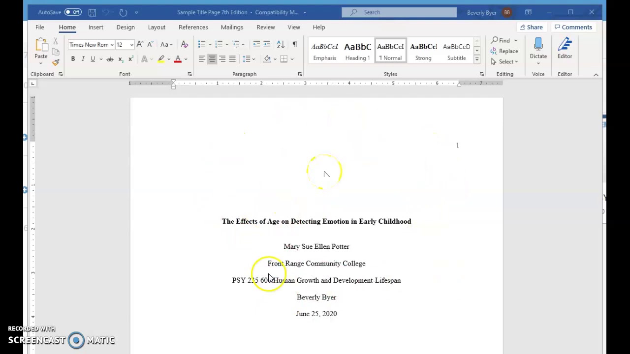
Double-spacing, a cornerstone of APA 7th edition, applies to the entire manuscript, including the title page, abstract, body text, references, and appendices. This consistent spacing improves readability and allows for clear annotations and feedback. It’s important to avoid adding extra spaces between paragraphs or before and after headings.
Three key benefits of adhering to APA 7th edition font and spacing guidelines are improved readability, enhanced credibility, and streamlined submission processes. Readable text reduces strain on the reader and facilitates comprehension. Following established academic conventions enhances your credibility as a researcher. And adhering to these guidelines simplifies the submission process, avoiding formatting-related revisions.
An action plan for implementing APA 7th formatting begins with selecting an approved font and setting your document to double-spacing. Use the “Styles” feature in your word processor to ensure consistency. Regularly review your work against the APA 7th edition manual or a reliable online resource.
Advantages and Disadvantages of Strict Adherence to APA 7th Edition Formatting
| Advantages | Disadvantages |
|---|---|
| Enhanced readability and comprehension | Can feel restrictive to creative expression |
| Improved credibility and professionalism | Requires meticulous attention to detail |
| Streamlined submission and publication process | Can be time-consuming, especially for lengthy documents |
Best Practices:
1. Use the “Styles” feature in your word processor.
2. Consult the official APA 7th edition manual.
3. Utilize online APA formatting checkers.
4. Proofread carefully for consistent application.
5. Seek feedback from peers or instructors.
Frequently Asked Questions:
1. What is the preferred font size in APA 7th edition? (Answer: 12pt for Times New Roman, 11pt for Calibri, Arial, and Georgia, 10pt for Lucida Sans Unicode).
2. Should I double-space my entire document? (Answer: Yes, including the title page, abstract, body, references, and appendices).
3. Are there any exceptions to the double-spacing rule? (Answer: Generally, no, but consult the manual for specific instances).
In conclusion, mastering APA 7th edition font and spacing is like adding the finishing touches to a perfectly tailored garment. While seemingly minor details, these elements contribute significantly to the overall presentation and impact of your work. They enhance readability, project professionalism, and ensure that your ideas are communicated clearly and effectively. By embracing these conventions, you elevate your academic writing, demonstrating not only your understanding of the subject matter but also your commitment to scholarly rigor. So, take the time to familiarize yourself with these guidelines – the benefits are well worth the effort. Your meticulously formatted document, much like a well-tailored suit, will make a lasting impression.
Decoding your alkosto card statement
Harry potter had enough of snape fanfiction a deep dive
Spice up your chats exploring the world of juegos hot para whatsapp
apa 7th edition font and spacing - Khao Tick On
Do you double space in apa format Line spacing 2022 - Khao Tick On
How To Make An Apa 7th Table - Khao Tick On
APA 7th Edition Template and Guide Instant Download - Khao Tick On
apa 7th edition font and spacing - Khao Tick On
Apa 7th edition reference page - Khao Tick On
apa 7th edition font and spacing - Khao Tick On
apa 7th edition font and spacing - Khao Tick On
Apa 7Th Edition Professional Paper Template - Khao Tick On
How to Format APA Style in Microsoft Word - Khao Tick On
APA Referencing 7th Ed Quick Guide - Khao Tick On
Apa 7th Edition Manual Pdf - Khao Tick On
APA Format Margins And Spacing - Khao Tick On
apa 7th edition font and spacing - Khao Tick On
apa 7th edition font and spacing - Khao Tick On


