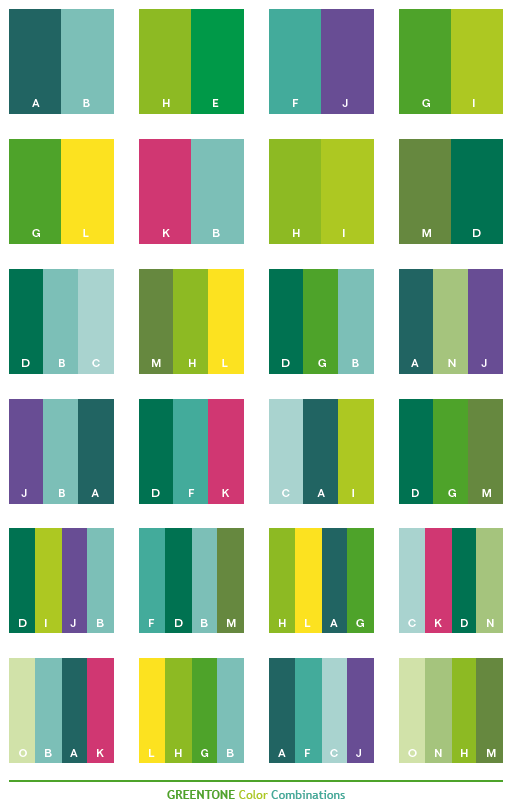
Dive into the captivating realm of dark green, a color that whispers of ancient forests, evokes a sense of tranquility, and adds a touch of sophisticated drama to any visual landscape. From the deep emerald tones of precious gemstones to the shadowy hues of a hidden jungle canopy, dark green embodies a spectrum of moods and meanings, offering designers and creatives a powerful tool for conveying complex emotions and creating impactful experiences.
Dark green color schemes have become increasingly prominent in recent years, appearing in everything from website interfaces and brand logos to interior design and fashion. This resurgence of interest isn't simply a fleeting trend; it's a reflection of our growing desire to reconnect with nature and embrace a sense of calm in a fast-paced, digitally-driven world. This article will delve into the multifaceted nature of dark green, exploring its historical roots, psychological impact, and practical applications in various design disciplines.
Historically, dark green has been associated with growth, prosperity, and renewal. In many cultures, it symbolizes nature's abundance and the life-giving power of the earth. Think of the lush green landscapes depicted in Renaissance art, representing fertility and the cycle of life. This deep-rooted connection to nature explains why dark green continues to resonate with us on a visceral level, evoking feelings of serenity, stability, and connection to the natural world.
One of the key advantages of using dark green is its versatility. It can be paired with a wide range of other colors to create vastly different moods and aesthetics. Combined with gold or brass, dark green exudes an air of luxury and sophistication. Paired with earthy tones like brown and beige, it creates a warm, inviting atmosphere. And when contrasted with vibrant colors like pink or orange, dark green provides a grounding element that balances the overall composition. This adaptability makes it a valuable asset for designers seeking to create cohesive and visually compelling color stories.
However, utilizing dark green effectively requires careful consideration. One potential drawback is its tendency to appear heavy or overwhelming if used in large quantities, particularly in poorly lit spaces. Therefore, balancing dark green with lighter shades, incorporating ample white space, and paying attention to contrast are crucial for achieving a harmonious and visually pleasing result. Understanding the nuances of dark green color combinations is essential for harnessing its full potential and avoiding common design pitfalls.
A deep forest green offers a serene backdrop for a website specializing in eco-tourism. A rich emerald green logo can convey the trustworthiness and stability of a financial institution. A dark olive green wall color can create a calming and sophisticated ambiance in a living room. The possibilities are endless, and the only limit is your imagination.
Understanding the psychology of color is key to effectively utilizing dark green. Deep greens evoke feelings of calmness, security, and balance, making them ideal for spaces where relaxation and focus are desired.
Implementing dark green schemes can be enhanced by considering the principles of color theory. Complementary colors like reds and oranges can provide striking accents, while analogous colors like blues and yellows create a harmonious flow.
Experiment with different shades and tints of dark green to discover the perfect palette for your project. From deep forest green to subtle sage, there’s a shade of dark green to suit every aesthetic.
Advantages and Disadvantages of Dark Green Colour Schemes
| Advantages | Disadvantages |
|---|---|
| Evokes feelings of calmness and sophistication | Can appear heavy or overwhelming if used excessively |
| Versatile and pairs well with a wide range of colours | Can be challenging to achieve adequate contrast with certain text colours |
| Connects with nature and promotes a sense of tranquility | May not be suitable for all industries or brand identities |
Dark green, when used thoughtfully, can be a transformative element in any design project. Whether you're crafting a website, designing a logo, or decorating a space, the rich and versatile hues of dark green offer endless possibilities for creating impactful and memorable experiences. By understanding the principles of color theory and the psychology of color, you can unlock the full potential of dark green and harness its power to evoke emotion, enhance brand identity, and transform any visual landscape.
Beyond the horizon understanding casa judeteana de pensii and your future
Walking head on the future of human computer interaction
Understanding the human body male and female
8 Beautiful Color Palettes For Your Next Design Project - Khao Tick On
A blue and green kitchen color scheme promotes relaxation and - Khao Tick On
Green Bedroom Color Scheme Dark blue Grey - Khao Tick On
Green Room Colors Dark Green Rooms Green Color Schemes Green Pallete - Khao Tick On
Hunter Green Color Palette - Khao Tick On
35 Best Green Color Palettes with Names and Hex Codes - Khao Tick On
Awasome Interior Paint Color Palette Combinations References - Khao Tick On
What Colour Goes With Brown And Green at Sonia Walton blog - Khao Tick On
Home Decor Bedroom Modern Bedroom Bedroom Interior House Interior - Khao Tick On
Emerald green and gold color scheme - Khao Tick On
dark green colour schemes - Khao Tick On
The Best Living Room Color Schemes - Khao Tick On
A rich range of color - Khao Tick On
What Colour Goes With Brown And Green at Sonia Walton blog - Khao Tick On
35 Best Green Color Palettes with Names and Hex Codes - Khao Tick On


