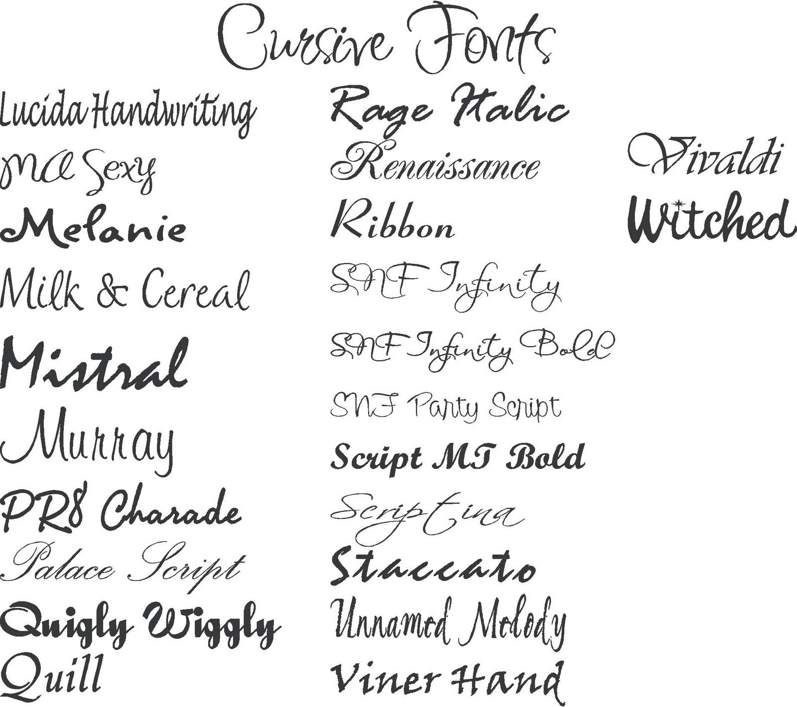
In the digital age, where words dominate screens, the art of typography has become more critical than ever. The specific typeface choices, encompassing both font styles and names, have a profound impact on how we perceive and engage with digital content. From the elegant curves of a serif to the clean lines of a sans-serif, each font carries its own personality and conveys a distinct message.
Think about navigating a website. The typeface used can instantly communicate the brand's personality – is it professional, playful, or modern? Font choices significantly influence readability, accessibility, and overall user experience. Choosing the right typeface can be the difference between a captivating user experience and a frustrating one.
This exploration into the world of digital typography delves into the history, evolution, and impact of various font styles and their names. We'll uncover how these choices affect readability, accessibility, and user engagement. This journey through the landscape of fonts aims to equip you with the knowledge to make informed typeface decisions, enhancing your digital communication.
The history of typefaces is intertwined with the evolution of written language itself. From the earliest forms of calligraphy to the advent of the printing press and now the digital era, the way we represent words visually has constantly evolved. Understanding this historical context provides valuable insights into the nuances of different font styles and their appropriate applications.
Early fonts, often serif-based, reflected the influence of handwritten scripts. The transition to digital typefaces opened up a new realm of possibilities, leading to the creation of countless font families, each with its own unique characteristics and purpose. Exploring these origins unveils the rich tapestry of typographic evolution.
The importance of font choices cannot be overstated. Consider the impact of using Comic Sans for a serious academic paper versus a professional, serif font like Times New Roman. The visual presentation of text directly influences its perceived credibility and the reader's overall impression. Choosing the correct font sets the tone and communicates the intended message effectively.
Typography plays a crucial role in accessibility. Certain fonts are easier to read for people with visual impairments. For example, fonts with larger x-heights and clear letterforms are often preferred. Understanding accessibility considerations is paramount for creating inclusive digital content.
One key benefit of selecting appropriate fonts is enhanced readability. Choosing typefaces that are easy on the eyes improves the user experience and encourages engagement. Clear, well-defined characters contribute to a smoother reading flow, allowing readers to focus on the content rather than struggling to decipher the text.
Another benefit is establishing brand identity. Consistent use of specific font styles creates a cohesive visual language that reinforces brand recognition. Think of the distinct typeface used by a popular technology company – it becomes synonymous with their brand image.
Finally, effective font choices contribute to a positive user experience. A well-designed website or document with thoughtfully chosen typefaces enhances the overall aesthetic appeal and makes the content more accessible and enjoyable to consume.
Advantages and Disadvantages of Different Font Styles
Serif fonts, like Times New Roman, are often seen as traditional and professional. Sans-serif fonts, such as Arial, convey a modern and clean aesthetic. Script fonts, resembling handwriting, can add a touch of elegance or playfulness.
Best practices include considering the target audience, the medium of communication, and the overall message being conveyed. Maintaining consistency in font usage throughout a project is also essential for a cohesive visual presentation.
Real-world examples include the font choices of major brands, news websites, and book publishers. Each carefully selects typefaces to align with their brand identity and target audience.
Challenges in font selection include balancing aesthetics with readability and ensuring accessibility across different devices and platforms. Solutions involve thorough testing and consideration of user experience guidelines.
Frequently asked questions often revolve around font pairings, licensing restrictions, and best practices for web typography.
Tips and tricks include utilizing font preview tools, exploring font libraries, and staying updated on current typography trends.
In conclusion, understanding the nuances of writing styles, fonts, and their names is crucial for effective digital communication. From historical context to practical application, making informed typeface choices enhances readability, reinforces brand identity, and creates a positive user experience. By embracing the power of typography, we can elevate our digital content and connect with our audience on a deeper level. Explore the vast world of fonts, experiment with different styles, and discover the transformative impact of well-chosen typography. The right font can truly make all the difference.
Floral butterfly tattoo stencil your guide to inking elegance
Level up your gamertag the art of cool gaming name symbols
Experience the magic a luke combs tribute show in sydney
16 FREE calligraphy fonts for your next creative project - Khao Tick On
Tattoo Name Fonts Tattoo Lettering Styles Name Tattoo Designs Tattoo - Khao Tick On
stylish fonts Tattoo Writing Styles Tattoo Font Styles Tattoo Fonts - Khao Tick On
Different types of fonts - Khao Tick On
Types Of Cursive Writing - Khao Tick On
writing styles fonts names - Khao Tick On
Sign Writing Font Generator at Frank Ellis blog - Khao Tick On
Tattoo Style Name Edit at Vanessa Jones blog - Khao Tick On
Processing Time for World Christianship Ministries - Khao Tick On
Different Cursive Lettering Styles - Khao Tick On
Chest Tattoo Writing Tattoo Writing Styles Tattoo Writing Fonts - Khao Tick On
Pretty Fonts For Writing - Khao Tick On
36 Font Styles to Consider When Branding Your Business or Blog - Khao Tick On
writing styles fonts names - Khao Tick On
writing styles fonts names - Khao Tick On


