Ever stare at a wall of text and feel… something’s off? It’s likely the font. In the digital age, where words dominate our screens, the font family you choose wields surprising power. Within Microsoft Word lies a universe of typographic choices, each capable of subtly shifting the tone and impact of your writing. This deep dive explores the diverse world of fonts in Word, unraveling their secrets and empowering you to make informed design decisions.
From crisp sans-serif styles to elegant serif classics, Word’s font library offers a vast spectrum. But what’s the difference, and why should you care? The right font can elevate a simple document into a professional masterpiece, while the wrong one can render your meticulously crafted prose unreadable. Understanding the nuances of each font category is key to harnessing the power of typography.
Fonts in Word aren’t just about aesthetics. They influence readability, convey brand identity, and even evoke specific emotions. Think about Times New Roman – the stalwart of academic papers, or the playful Comic Sans, often (and perhaps unfairly) relegated to less formal communications. Each font carries its own baggage, its own history, and its own set of associations.
The history of font styles in Word is intertwined with the evolution of digital typography itself. As technology advanced, so did the availability and sophistication of fonts. From the early days of limited bitmap fonts to the current vast libraries of TrueType and OpenType fonts, Word has continuously adapted to offer users a wider range of typographic options. This evolution has empowered users to create visually engaging and professionally designed documents.
Navigating this expansive collection can be daunting. Where do you begin? This guide will break down the primary font categories available in Word – serif, sans-serif, script, decorative, and monospace – providing clear definitions, practical examples, and best practices for utilizing each.
Serif fonts, characterized by small decorative strokes at the end of each character, exude a classic, traditional feel. Times New Roman, Georgia, and Garamond are prime examples. Sans-serif fonts, lacking these serifs, project a modern, clean aesthetic. Calibri, Arial, and Helvetica are popular choices in this category.
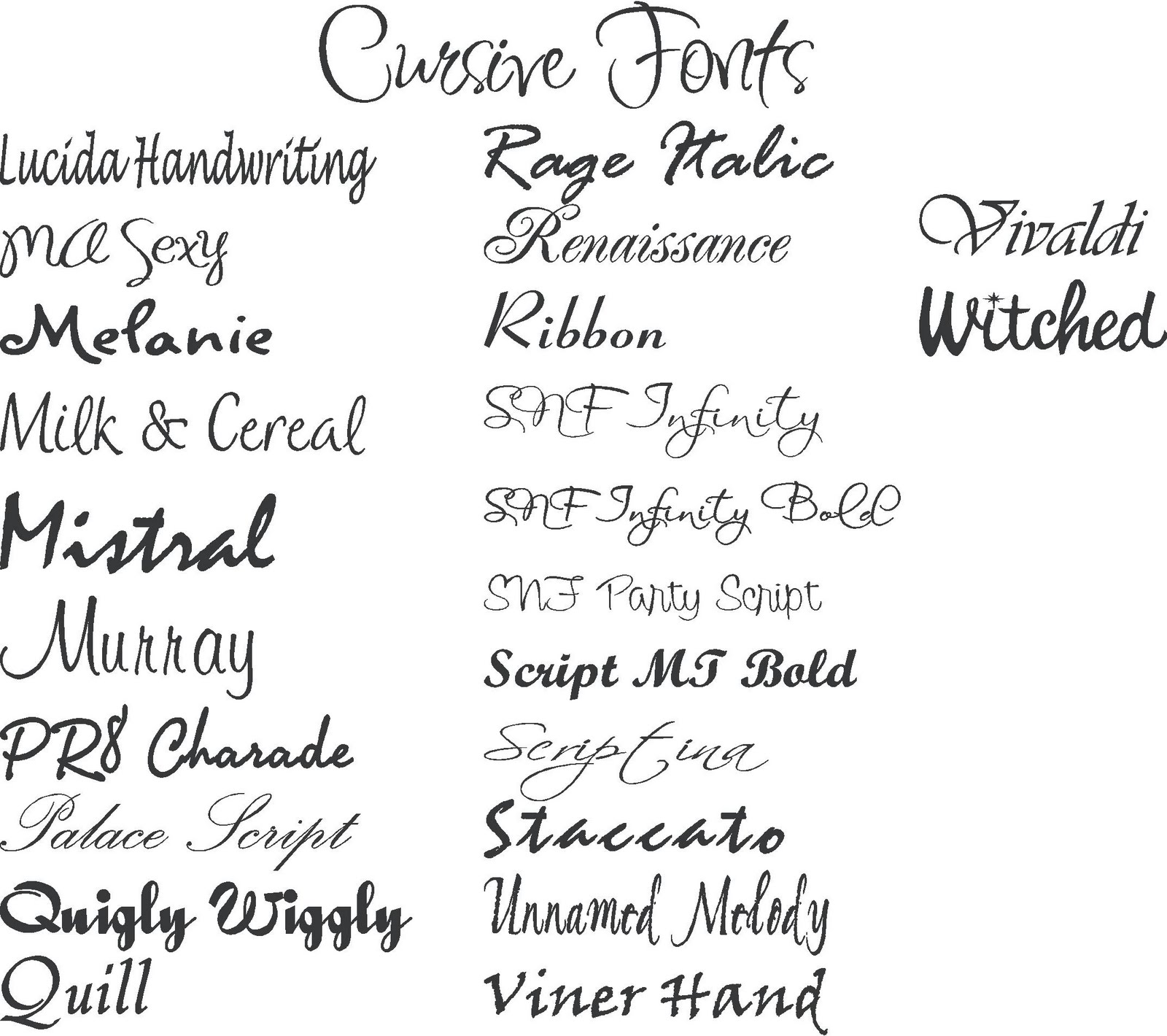
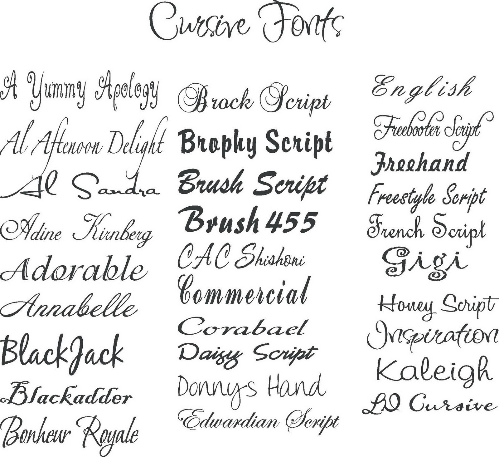
Script fonts mimic handwriting, adding a touch of elegance or whimsy to your text. Brush Script and Lucida Calligraphy are illustrative examples. Decorative fonts, as the name suggests, are designed for specific visual impact, often used for headings or short bursts of text. Finally, monospace fonts, where each character occupies the same horizontal space, are commonly used for coding or displaying data.
Leveraging the right font can significantly enhance readability. For large blocks of text, serif fonts are often preferred due to their distinct character shapes, which aid in visual flow. Sans-serif fonts excel in headlines and shorter text segments, offering a clean and modern appearance.
One key benefit of utilizing a variety of font styles is the ability to establish visual hierarchy. Headings set in a bold sans-serif font can clearly distinguish sections, while body text in a legible serif font provides a comfortable reading experience. Another advantage is the power to reinforce brand identity. Choosing fonts that align with your brand's personality can create a cohesive and professional image.
When selecting fonts, consider your audience, purpose, and the overall tone you want to convey. Pairing fonts effectively is also crucial. Avoid using too many different fonts in a single document, as this can create a cluttered and unprofessional look. Stick to two or three complementary fonts for optimal visual harmony.
Advantages and Disadvantages of Different Font Types
| Font Type | Advantages | Disadvantages |
|---|---|---|
| Serif | Readability in long texts, classic appearance | Can appear outdated in some contexts |
| Sans-serif | Modern, clean, good for headlines | Can be less readable in very long texts |
| Script | Elegant, decorative | Can be difficult to read in large quantities |
| Decorative | Visually striking | Often unsuitable for body text |
Choosing the correct typeface for your Word document can dramatically impact its effectiveness. By understanding the nuances of each font category and following best practices, you can elevate your writing and create visually compelling content that resonates with your audience.
Font selection in Word is more than just a stylistic choice; it’s a strategic decision. By carefully considering the various font families available and understanding their impact on readability and overall design, you can transform your documents from simple text into powerful communication tools.
Double the design unveiling stunning two tone room ideas
Unlocking the roblox soundscape cry solo roblox id code
Moon over hyderabad catch the lunar show tonight
80 Free Wood Type Alphabets - Khao Tick On
Printable Handwriting Font Template - Khao Tick On
types of fonts in word - Khao Tick On
Best Signage Fonts Free Download at Gilbert Woodcock blog - Khao Tick On
Types Of Cursive Writing - Khao Tick On
types of fonts in word - Khao Tick On
Free Font Collection 18 Modern Fonts - Khao Tick On
Handwriting Names In Word - Khao Tick On
Sign Writing Font Generator at Frank Ellis blog - Khao Tick On
Microsoft Word Script Fonts - Khao Tick On
types of fonts in word - Khao Tick On
Another Word For Company Swag at clintpstarro blog - Khao Tick On
Different Types Of Fonts For Logos - Khao Tick On
What Font Options at David Matthews blog - Khao Tick On
16 FREE calligraphy fonts for your next creative project - Khao Tick On


