Ever squint at a website, wishing the text was just a little bigger? You're not alone. Mastering CSS font sizing is a crucial skill for web developers, impacting readability and accessibility. This guide dives deep into the world of CSS font control, offering you the secrets to perfect text sizing.
From pixels to percentages, we'll explore the various units of measurement for CSS font sizing, helping you choose the right tool for the job. We'll also uncover how inheritance and cascading styles can impact your text, and how to troubleshoot common font-sizing woes.
The evolution of web design has placed increasing emphasis on user experience. A core component of this is typography, with appropriate font sizing playing a vital role. Early websites often suffered from rigid text sizing, limiting accessibility. The introduction of CSS revolutionized this, empowering developers to fine-tune text for a variety of devices and user preferences.
Controlling font size is essential for creating accessible websites. Users with visual impairments rely on the ability to adjust text size to comfortably read content. Properly implemented CSS font sizing ensures your website caters to a wider audience.
One common issue is the conflict between different sizing units. Mixing pixels and ems, for instance, can lead to unexpected results. Understanding the relationship between different units is key to achieving consistent font sizing across your website.
You can adjust font size using a variety of units, including pixels (px), ems (em), rems (rem), percentages (%), and viewport units (vw, vh). Pixels offer fixed sizing, while ems and rems are relative to parent or root font sizes, respectively. Percentages and viewport units offer dynamic sizing based on browser window dimensions.
Benefits of Proper Font Sizing:
1. Enhanced Readability: Larger, well-sized text is easier to read, reducing eye strain and improving user experience.
2. Improved Accessibility: Customizable font sizes cater to users with visual impairments.
3. Professional Design: Consistent and appropriate font sizing contributes to a polished and professional website design.
Step-by-Step Guide to Increasing Font Size:
1. Identify the element you want to modify (e.g., paragraph, heading).
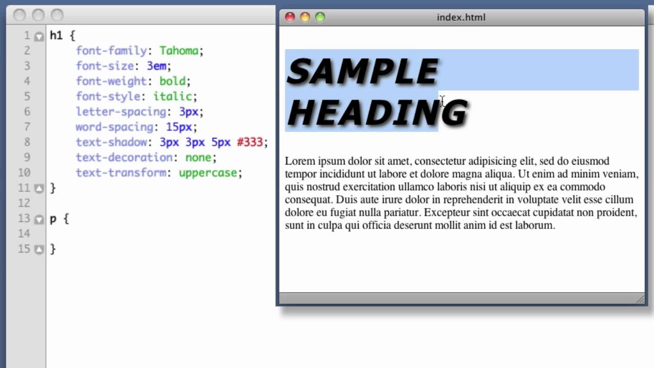
2. Use the `font-size` property in your CSS.
3. Specify the desired size and unit (e.g., `font-size: 16px;`, `font-size: 1.2em;`).
Best Practices:
1. Use relative units (em, rem) for greater flexibility and responsiveness.
2. Avoid using pixels for body text.
3. Test your font sizes on different devices and browsers.
4. Consider user preferences and accessibility guidelines.
5. Use a consistent sizing scale throughout your website.
Real-World Examples:
1. Setting paragraph text to 1.1rem: `p { font-size: 1.1rem; }`
2. Increasing heading size by 150% of parent element: `h2 { font-size: 1.5em; }`
3. Using viewport units for responsive headings: `h1 { font-size: 4vw; }`
4. Setting a base font size for the entire website: `html { font-size: 10px; }`
5. Adjusting button text size: `button { font-size: 1.2em; }`
Advantages and Disadvantages of Different Font Size Units
| Unit | Advantages | Disadvantages |
|---|---|---|
| px | Precise control | Not responsive |
| em | Relative to parent element | Can become complex to manage |
| rem | Relative to root element | Less browser support than other units (but still very good) |
Challenges and Solutions:
1. Inconsistent Sizing: Ensure consistent use of units and understand inheritance.
2. Accessibility Issues: Use relative units and allow users to override font sizes.
3. Responsiveness Problems: Utilize viewport units or media queries for responsive design.
4. Conflicting Styles: Use specific selectors to override unwanted inherited styles.
5. Overly Large or Small Text: Test on different devices and adjust accordingly.
FAQ:
1. What is the difference between em and rem? Ems are relative to the parent element, while rems are relative to the root.
2. How can I make my font size responsive? Use viewport units or media queries.
3. What is the best unit for font sizing? Rems are often preferred for their scalability.
4. How do I change the font size of a specific element? Use CSS selectors to target the element.
5. How can I increase the font size for accessibility? Use relative units and allow user overrides.
6. What is the default font size in browsers? Typically 16px.
7. Can I use different font sizes for different devices? Yes, using media queries.
8. How do I prevent inheritance from affecting my font size? Use the `font-size: initial;` property.
Tips and Tricks:
Use a browser's developer tools to experiment with different font sizes in real-time. This allows you to fine-tune your text sizing and see the results immediately.
Mastering CSS font sizing is crucial for creating visually appealing and accessible websites. From understanding the various units of measurement to implementing best practices and troubleshooting common issues, this guide has equipped you with the knowledge to enhance your web development skills. By prioritizing readability, accessibility, and responsive design, you'll create a positive user experience that sets your website apart. So, embrace the power of CSS and embiggen your text with confidence! Don't wait, start optimizing your website's typography today and reap the benefits of a well-designed and user-friendly online presence.
Top rated vehicle jump starters your ultimate guide
Unlocking the potential of benjamin moore green paints
Decoding the are you or arent you meme phenomenon
How To Change Font Position In Css at Noel Peters blog - Khao Tick On
how to increase size of font in css - Khao Tick On
Simple Html Simple Image Learn Computer Coding Computer Science Css - Khao Tick On
Web Design with Bootstrap on Flipboard by Jacob Lett - Khao Tick On
how to increase size of font in css - Khao Tick On
How to increase font size in excel keyboard shortcut - Khao Tick On
How To Change Default Font On Iphone Mail at Marlene Budd blog - Khao Tick On
Week in Lithuania Seimas approves zero VAT on heating for two seasons - Khao Tick On
Stamps Price Increase 2024 Uk - Khao Tick On
how to increase size of font in css - Khao Tick On
Acromegaly In A Man 3D Illustration Royalty - Khao Tick On
Tailwind CSS v34 Dynamic viewport units has support balanced - Khao Tick On
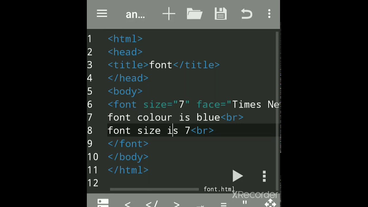
How to change font color size font of the text in html - Khao Tick On
Acromegaly In A Man 3D Illustration - Khao Tick On
How To Change The Font Size Of A Chart In Excel - Khao Tick On


