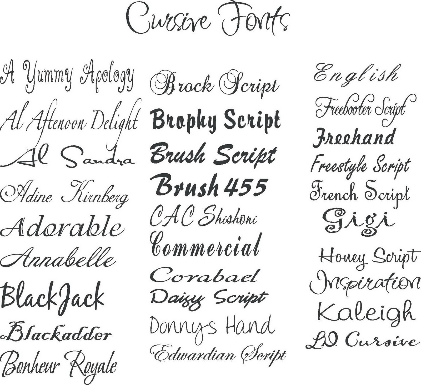
Ever wonder why some text just *feels* right? It's likely due to the carefully selected typeface, better known as the font. Fonts are more than just letters on a screen; they're the visual voice of your content. Choosing the correct font can transform a mundane message into a powerful statement. This exploration of typography delves into classic font names, offering examples and explaining their significance in the world of design.
From the elegant curves of Garamond to the clean lines of Helvetica, fonts have a rich history intertwined with art, technology, and communication. Early typefaces were painstakingly carved into wood and metal, each character a miniature masterpiece. The invention of the printing press revolutionized font creation and distribution, leading to the proliferation of diverse type styles. Understanding the evolution of fonts helps us appreciate the nuances of each design and their impact on readability and aesthetics.
The selection of a font is crucial for effective communication. A playful script font might suit a whimsical children's book, but it would be inappropriate for a legal document, where clarity and formality are paramount. Classic fonts like Times New Roman and Arial have earned their place in design history for their versatility and readability. Knowing the characteristics of different typefaces empowers you to make informed decisions that enhance the overall message of your content.
Navigating the vast landscape of fonts can be daunting. With thousands of options available, selecting the perfect typeface can feel overwhelming. This guide will introduce you to some of the most iconic and enduring font families, providing examples and insights to help you understand their unique personalities. We'll delve into the history, origins, and common usage of these typographic staples.
So, buckle up and prepare for a fontastic journey through the world of typography. Discover the power of classic fonts, learn to identify their distinctive features, and unlock the secrets to effective visual communication. Whether you're a seasoned designer or a curious beginner, this exploration will enhance your appreciation for the art of type.
Definitions:
Serif fonts: Characterized by small decorative strokes, or serifs, at the ends of letterforms (e.g., Times New Roman, Garamond).
Sans-serif fonts: Lacking serifs, resulting in a clean, modern look (e.g., Helvetica, Arial).
Benefits of Using Classic Fonts:
Readability: Classic fonts are often designed for optimal readability, making them suitable for large bodies of text.
Versatility: They can be used across a wide range of media, from print to web.
Professionalism: Classic fonts often convey a sense of authority and trustworthiness.
Advantages and Disadvantages of Specific Fonts
| Font | Advantages | Disadvantages |
|---|---|---|
| Times New Roman | Readability, traditional, formal | Can appear dated, overused |
| Arial | Clean, versatile, web-safe | Can appear generic, lacking personality |
Best Practices:
1. Pair fonts carefully: Combine contrasting fonts for visual interest while maintaining readability.
2. Consider the context: Choose fonts that align with the tone and purpose of your content.
3. Optimize for different devices: Ensure your chosen fonts render correctly on various screens and browsers.
4. Limit the number of fonts: Using too many fonts can create a cluttered and unprofessional look.
5. Test your fonts: Preview your designs on different devices and in various sizes to ensure readability.
Real Examples:
1. The New York Times (Times New Roman)
2. Medium (custom serif font)
3. Google (Product Sans)
4. BBC News (Arial)
5. Apple (San Francisco)
FAQs:
1. What is the difference between a font and a typeface? (Typeface refers to the design, while font refers to a specific weight and style within that typeface.)
2. What are web-safe fonts? (Fonts commonly installed on most computers, ensuring consistent display across different browsers.)
Tips and Tricks:
Use font pairing tools to find complementary typefaces.
In conclusion, the world of fonts is a fascinating and essential aspect of design. From the timeless elegance of Garamond to the clean modernity of Helvetica, classic fonts play a crucial role in shaping our visual landscape. Understanding their history, characteristics, and best practices for implementation empowers us to communicate effectively and create visually appealing content. By carefully considering the nuances of typography, we can elevate our designs and enhance the overall user experience. So, take the time to explore the rich diversity of fonts, experiment with different combinations, and discover the power of typography to transform your communication. Choosing the right font is more than just an aesthetic decision; it's an investment in clarity, readability, and the overall impact of your message.
Unleash your inner artist drawings to color for fun
Navigating illinois stay at home orders
Navigating nfl week 18 decoding espns expert predictions
45 Best Canva Font Pairings - Khao Tick On
font names and examples of classic fonts - Khao Tick On
Microsoft Word Font Styles List With Examples - Khao Tick On
Font names and examples - Khao Tick On
Free Font Collection 18 Modern Fonts - Khao Tick On
How To Change Font Family In Bootstrap at Edna Sass blog - Khao Tick On
25 Best Free Fonts in Canva in 2023 A Guide for Designers - Khao Tick On
font names and examples of classic fonts - Khao Tick On
font names and examples of classic fonts - Khao Tick On
Cool Font Examples at James Mcelroy blog - Khao Tick On
What font choices are there for my text - Khao Tick On
Best Cursive Font For Vinyl at Antionette Stacy blog - Khao Tick On
38 Top Fonts for Design - Khao Tick On
Best Free Luxury Fonts - Khao Tick On
Free Font Collection 18 Modern Fonts - Khao Tick On


