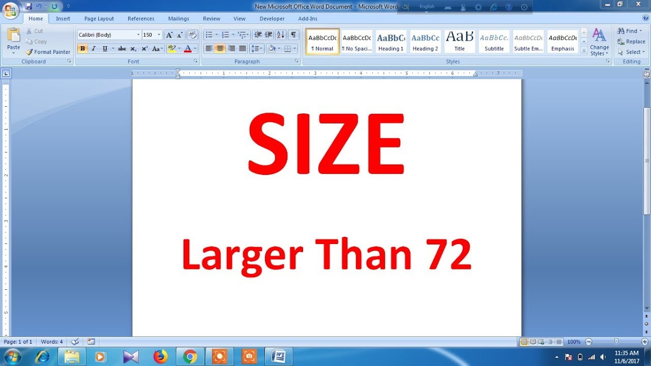
Ever squint at a website, wishing the text was, well, BIGGER? You're not alone. The struggle is real, especially as screens shrink and eyes…don't. This isn't just about comfort, it's about accessibility and making sure everyone can enjoy the internet. So, how do you pump up those pixels and create a website that's easy on the eyes? Let's dive into the fascinating world of website font sizing.
Imagine trying to read a street sign from across a football field. Frustrating, right? That's what inadequate font sizing can feel like. It's a digital accessibility roadblock. Websites with tiny text exclude a significant portion of the population, especially those with visual impairments. Increasing website font size isn't just a nice-to-have, it's a necessity.
The history of web font sizes is a tale of evolution. Early websites were simple, with limited font options. As the web grew, so did the need for dynamic and adaptable text. Cascading Style Sheets (CSS) revolutionized font control, allowing developers to adjust text size with unprecedented precision.
Boosting website font size is crucial for accessibility. People with low vision, dyslexia, or other visual impairments rely on larger text to access online content. Larger fonts also benefit users on smaller screens, such as mobile phones, where tiny text can be a nightmare.
One key issue is finding the sweet spot. Text that's too large can be just as problematic as text that's too small, creating an overwhelming, clunky experience. The goal is to enhance readability without sacrificing aesthetics or functionality.
A simple example of adjusting font size is using the `font-size` property in CSS. For instance, `font-size: 20px;` sets the font size to 20 pixels. You can also use relative units like `em` or `rem`, which are relative to the default font size or the root element's font size, respectively.
Benefits of Larger Website Fonts:
1. Improved Readability: Larger fonts make text easier to decipher, reducing eye strain and improving comprehension.
2. Enhanced Accessibility: Larger fonts make websites accessible to a wider audience, including users with visual impairments.
3. Better User Experience: Larger fonts contribute to a more comfortable and enjoyable browsing experience, especially on smaller screens.
Action Plan for Increasing Font Size:
1. Analyze your current font sizes: Use browser developer tools to check your website's font sizes.
2. Experiment with different sizes: Test different font sizes to find the optimal balance between readability and aesthetics.
3. Implement changes using CSS: Update your website's CSS to reflect the chosen font sizes.
Advantages and Disadvantages of Larger Website Fonts
| Advantages | Disadvantages |
|---|---|
| Improved readability | May require more scrolling |
| Enhanced accessibility | Can affect website layout |
| Better user experience | May reduce content density |
Best Practices:
1. Use relative units (em, rem) for flexible scaling.
2. Test across different devices and browsers.
3. Consider user preferences and accessibility guidelines.
4. Avoid excessively large fonts.
5. Maintain a consistent font size hierarchy.
FAQ:
1. How do I change font size in CSS? Use the `font-size` property.
2. What are relative font units? `em` and `rem` are relative units that scale with the base or root font size.
3. How can I make my website more accessible? Increase font size and contrast.
4. What's the ideal font size for websites? It depends on the font and context, but generally aim for at least 16px.
5. Can I change font size for specific elements? Yes, use CSS selectors to target specific elements.
6. How do I test font sizes on different devices? Use browser developer tools or test on real devices.
7. Are there accessibility guidelines for font size? Yes, WCAG provides guidelines for web accessibility.
8. How do I adjust font size for mobile devices? Use media queries in CSS.
Tips and Tricks:
Use browser zoom functionality for quick font size adjustments.
Increasing website font size is more than just a design choice; it’s a commitment to inclusivity and a better user experience. By implementing the strategies and best practices outlined here, you can create a website that welcomes everyone, regardless of their visual abilities or device preferences. Empowering users with legible text not only enhances readability but also fosters a more engaging and enjoyable online experience. Remember, a website that's easy to read is a website that's easy to love. So, take the plunge, boost those fonts, and make your website a haven for clear, comfortable reading. Start optimizing your website's font size today and witness the transformative impact it can have on your audience reach and user engagement.
Uaes automotive rise manufacturing innovation and the road ahead
Unlocking the potential ford super duty 18 inch wheels
The powerful symbolism of a woman with a lion headdress tattoo
Best Cursive Fonts in Microsoft Word - Khao Tick On
Letter T Handwriting Fonts Free Illustrations Lettering Fonts Free - Khao Tick On
font preview Best Free Fonts Free Script Fonts All Fonts Font Free - Khao Tick On
Graffiti Lettering Fonts Lettering Alphabet Fonts Cursive Fonts - Khao Tick On
Terms of Reference to Incorporate Online Research Hub on Website - Khao Tick On
Lettering Fonts Lettering Alphabet Bold Fonts Free Illustrations - Khao Tick On
make website fonts larger - Khao Tick On
March Calligraphy Calligraphy Fonts Handwritten Calligraphy - Khao Tick On
How to make the font bigger on the iphone - Khao Tick On
Lettering Style Lettering Fonts Typography Rp Ideas Word Fonts - Khao Tick On
10 Fonts we Love for Creating Sales Graphics Why They Work - Khao Tick On
Quietum Plus Official Website - Khao Tick On
Learn Photoshop Photoshop Tutorial How To Make Everything Profile - Khao Tick On
Simple Acts Countdown Make a New Connection - Khao Tick On
How To Make Large Letters In Word at Mark Geno blog - Khao Tick On


