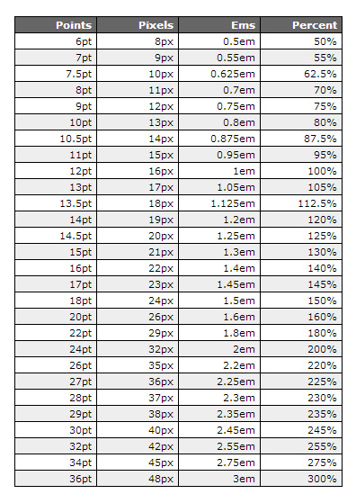
Have you ever wondered about the precise relationship between font point size and its actual size in inches? It's a common question, and understanding this connection is crucial for creating visually appealing and readable designs, whether you're working on a website, a printed document, or a graphic design project. Navigating the world of typography can feel complex, but grasping the fundamentals of font sizing can greatly simplify the process.
A font's point size represents a unit of measurement traditionally used in typography. While it's not a direct inch-for-inch correlation, understanding this relative measurement is essential. A "point" is approximately 1/72 of an inch. However, the actual height of the characters might not precisely match this calculation due to various factors like font design and the specific characters used. This guide explores this connection, offering clarity and practical advice for effectively using font sizes.
Historically, point sizes originated in the era of metal type. Each character was cast on a small block of metal, and the point size referred to the height of this metal block. While printing methods have evolved dramatically, the point system has persisted as a standard unit of measurement. This historical context helps explain why the relationship between points and inches isn't a simple one-to-one conversion. Different fonts with the same point size can appear slightly different in height due to their individual design characteristics.
Why is understanding this relationship so important? Effective font sizing is vital for clear communication. Choosing a font size that is too small can make text difficult to read, leading to eye strain and frustration for the reader. Conversely, a font size that is too large can appear overwhelming and unprofessional. Finding the right balance ensures readability and a positive user experience.
The essence of font sizing lies in finding harmony between aesthetics and functionality. A well-chosen font size enhances the visual appeal of a design while ensuring the content is easily digestible. This balance is particularly important in web design, where readability is paramount. Using a font size conversion chart or online tools can be invaluable resources for achieving this balance.
One benefit of understanding font point sizes is consistent sizing across different platforms. This allows for greater control over how your text appears regardless of the output medium. Another benefit is improved accessibility. By carefully considering font sizes, you can create designs that are accessible to a wider audience, including those with visual impairments. Finally, a good grasp of font sizing improves the overall aesthetic quality of your designs, making them more polished and professional.
Advantages and Disadvantages of Using Point Sizes
| Advantages | Disadvantages |
|---|---|
| Standard unit of measurement | Not a direct inch-for-inch conversion |
| Consistent sizing across platforms | Can vary slightly between different fonts |
Best practices for working with font sizes include testing different sizes for readability, considering the target audience, and maintaining consistency throughout a project. Additionally, using a font size conversion chart can be very helpful. Online tools can also assist in visualizing different font sizes and their corresponding measurements.
FAQ:
What is a point size? A point is a unit of measurement approximately 1/72 of an inch.
How do I convert point size to inches? Use a conversion chart or online tool.
Why do different fonts with the same point size look different? Font design influences the actual character height.
What is the ideal font size for web design? It depends on the font and overall design but generally 16px is recommended.
What is the standard font size for printed documents? 12 point is commonly used.
How does font size affect readability? Smaller sizes are harder to read.
Where can I find a font size conversion chart? Search online for "font size conversion chart".
How do I ensure my designs are accessible? Choose appropriate font sizes and contrast.
In conclusion, the relationship between font point size and inches may seem nuanced, but understanding its intricacies empowers you to create designs that are both visually appealing and highly readable. By considering the historical context, practical applications, and best practices outlined in this guide, you can confidently navigate the world of typography and ensure your designs communicate effectively with your audience. Remember, clear communication is the cornerstone of good design, and font size plays a crucial role in achieving this clarity. Take the time to experiment with different font sizes, utilize online resources and conversion charts, and always prioritize the readability and accessibility of your work.
Unlocking the magic of farrow and ball dead flat paint
Decoding the i heart emo boys shirt phenomenon
Top small thigh tattoo ideas for men a stylish discreet choice
Typography Rules You Should Know as a Designer - Khao Tick On
Font sizes font size conversion - Khao Tick On
Increase Font Size and Increase SEO RPM Along With It - Khao Tick On
font point size to inches chart - Khao Tick On
Font Size To Inches Chart A Complete Beginners Guide - Khao Tick On
Font Size Chart Pdf - Khao Tick On
font point size to inches chart - Khao Tick On
Printable Font Size Chart - Khao Tick On
Printable Font Size Chart - Khao Tick On
Increase Font Size and Increase SEO RPM Along With It - Khao Tick On
Printable Font Size Chart - Khao Tick On
Font Point Size To Inches Chart - Khao Tick On
Font Point Size Chart Pdf - Khao Tick On
Font Point Size To Inches Chart - Khao Tick On
Font Point Size To Inches Chart - Khao Tick On


