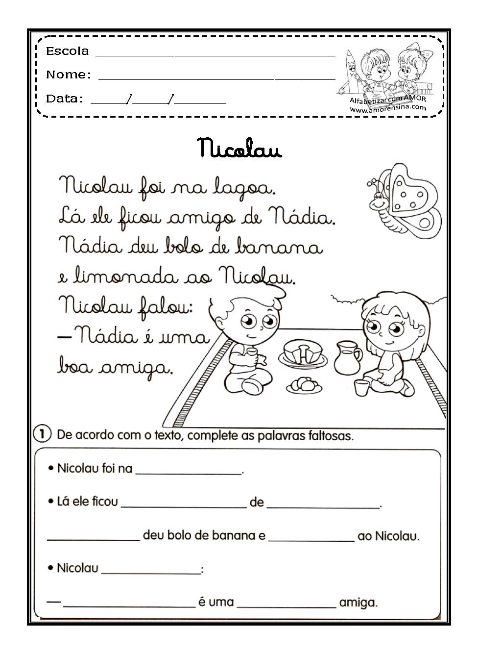
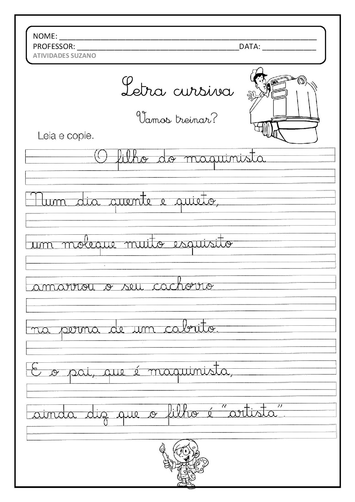
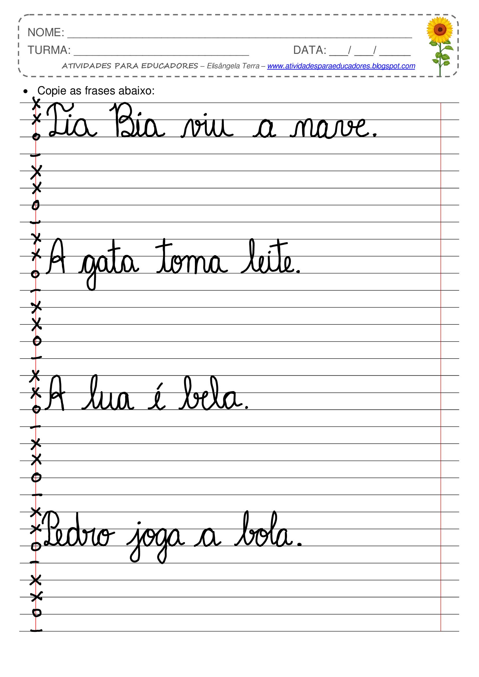
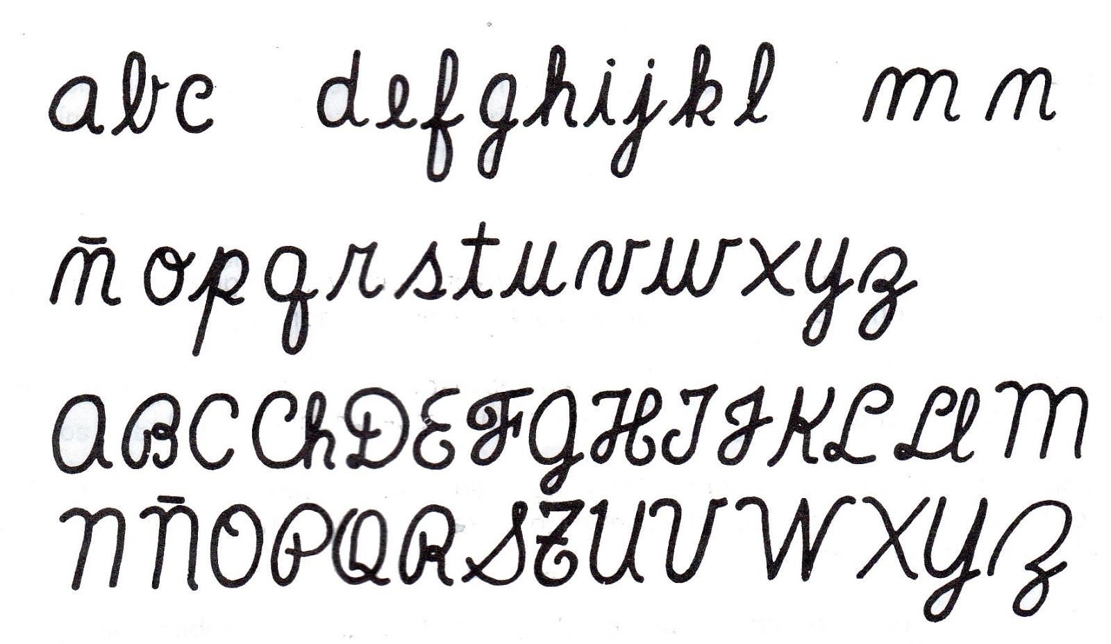
In the realm of typography, where letters dance across the digital canvas, italic fonts hold a special allure. Often associated with elegance, emphasis, and a touch of artistic flair, italics have the power to transform ordinary text into something visually captivating. Whether you're a seasoned designer or a casual user, understanding the nuances of italic fonts can elevate your written communication to new heights.
But what exactly are italic fonts, and why should you care? Simply put, italic fonts are characterized by their slanted appearance, leaning slightly to the right. This subtle tilt creates a sense of movement and flow, drawing the reader's eye across the page. From emphasizing key words and phrases to conveying emotions and setting a particular tone, italic fonts serve a variety of purposes in both print and digital media.
The history of italic fonts can be traced back to the Italian Renaissance, where scribes developed a cursive writing style known as "cancellaresca corsiva." This elegant script, characterized by its flowing strokes and slanted letters, was widely used for official documents and personal correspondence. Over the centuries, italic fonts evolved alongside printing technology, eventually finding their place in the digital age.
Today, italic fonts are an indispensable tool for designers, writers, and anyone looking to add a touch of sophistication and visual interest to their work. From website design and branding to book publishing and advertising, italics play a crucial role in conveying messages effectively and engaging audiences on a deeper level.
One of the key advantages of italic fonts is their ability to emphasize specific words or phrases within a larger body of text. Just like we use our voice to stress certain words when speaking, italics provide a visual cue that highlights important information. This can be particularly useful in academic writing, legal documents, or any context where clarity and precision are paramount. For example, you might use italics to highlight a technical term, a foreign word, or a quote within a sentence.
Beyond emphasis, italic fonts also excel at conveying emotions and setting a particular tone. The slanted script can evoke feelings of elegance, sophistication, or even a touch of playfulness, depending on the specific font and context. Imagine a wedding invitation adorned with delicate italic lettering or a whimsical children's book brought to life with playful, slanted type. The choice of italic font can dramatically influence the overall mood and message of a design.
As versatile as italic fonts are, it's essential to use them judiciously. Overusing italics can make your text appear cluttered and difficult to read. A light touch is key – reserve italics for specific purposes like emphasis, titles, or stylistic flourishes. When used thoughtfully, italic fonts can enhance the readability and visual appeal of your work, adding a touch of elegance and refinement to your written communication.
Dominate week 13 conquer your fantasy football league with expert ppr rankings
Navigating healthcare your questions answered
Unlocking the secrets of ming fai garment material co ltd
letra cursiva para copiar - Khao Tick On
letra cursiva para copiar - Khao Tick On
letra cursiva para copiar - Khao Tick On
letra cursiva para copiar - Khao Tick On
letra cursiva para copiar - Khao Tick On
letra cursiva para copiar - Khao Tick On
letra cursiva para copiar - Khao Tick On
letra cursiva para copiar - Khao Tick On
letra cursiva para copiar - Khao Tick On
letra cursiva para copiar - Khao Tick On
letra cursiva para copiar - Khao Tick On
letra cursiva para copiar - Khao Tick On
letra cursiva para copiar - Khao Tick On
letra cursiva para copiar - Khao Tick On
letra cursiva para copiar - Khao Tick On


