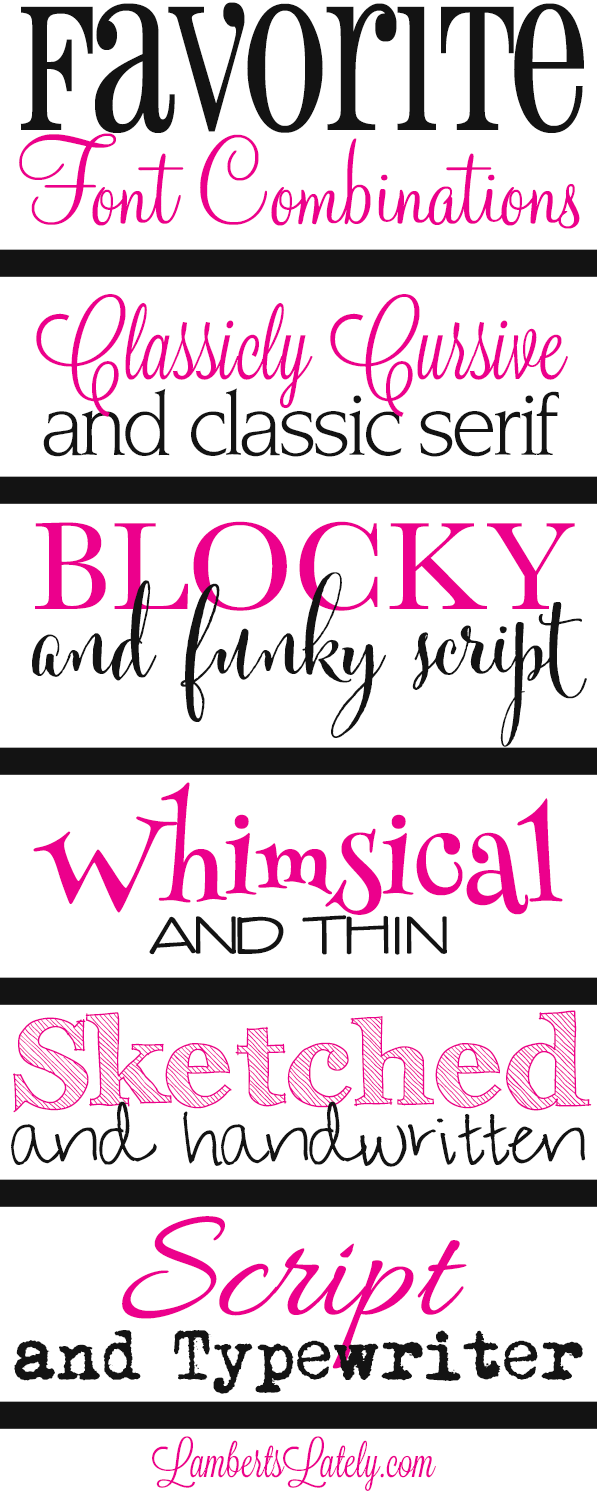
So, you're blasting out newsletters, huh? Think anyone's actually *reading* them? Probably not if your font looks like it crawled out of a Geocities graveyard. Seriously, choosing the right typeface for your email blasts is more important than you think. It's the difference between looking like a pro and looking like, well, an amateur.
Picking a suitable font for your newsletter isn't just about aesthetics, although that's a big part of it. It's about readability. People are inundated with emails. If your newsletter is a struggle to decipher, it's going straight to the trash. You need a font that's clear, concise, and easy on the eyes. Think of it as the gateway drug to your brilliant content.
This whole font thing might seem like a minor detail, but it's actually a crucial element of your overall newsletter strategy. The right typography can boost your brand image, improve engagement, and ultimately, drive conversions. The wrong font? Well, let's just say it can do the exact opposite. You could be sending out pure gold, but if it's wrapped in typographic garbage, no one's going to bother unwrapping it.
Think about it: you spend hours crafting compelling content, designing eye-catching graphics, and segmenting your audience. Don't let all that effort go to waste by slapping on a default font and calling it a day. A well-chosen font complements your message, reinforces your brand, and makes your newsletter a pleasure to read. It's the silent salesperson whispering sweet nothings into your subscribers' ears.
So, what constitutes a "good" newsletter font? Well, there's no one-size-fits-all answer, but there are definitely some best practices to follow. Generally, you want something clean, legible, and web-safe. Think Arial, Helvetica, Verdana, Georgia, Times New Roman – these are your bread-and-butter fonts. They're reliable, versatile, and render consistently across different email clients.
The history of fonts in newsletters is intertwined with the evolution of email itself. Early emails were plain text, so font choice wasn't even a consideration. As HTML email emerged, so did the ability to use different typefaces. This opened up a whole new world of design possibilities, but also introduced the challenge of cross-client compatibility. What looks great in Gmail might look like a jumbled mess in Outlook.
One crucial aspect of selecting the perfect newsletter font is considering your target audience. A playful, whimsical font might work for a children's clothing brand, but not so much for a financial institution. Your font should reflect your brand personality and resonate with your readers. It's all about creating a cohesive visual experience.
Benefits of a good newsletter font: 1) Increased Readability, 2) Enhanced Brand Recognition, 3) Improved Engagement.
Advantages and Disadvantages of Different Font Choices
| Font | Advantages | Disadvantages |
|---|---|---|
| Arial | Highly readable, web-safe | Overused, can appear generic |
| Georgia | Elegant, good for long-form content | May not be ideal for short snippets |
Best Practice 1: Stick to web-safe fonts. Example: Arial. Best Practice 2: Use a font size that's easy to read. Example: 14-16px. Best Practice 3: Limit your font choices. Example: Stick to one or two fonts for consistency.
Real-world example: The Skimm uses a clean, sans-serif font for its daily newsletter. This enhances readability and reinforces its brand of concise, digestible news.
Challenge: Font rendering inconsistencies across email clients. Solution: Test your newsletter in different email clients to ensure it looks good everywhere.
FAQ 1: What are web-safe fonts? Answer: Fonts that are commonly installed on most computers and devices, ensuring consistent display across different email clients.
Tip: Pair your chosen font with a complementary font for headings and subheadings to create visual hierarchy.
In conclusion, the font you choose for your newsletter is more than just a stylistic choice; it's a strategic decision that can significantly impact your email marketing success. From readability and brand recognition to engagement and conversions, the right typography can make all the difference. By following best practices, understanding your audience, and testing your emails thoroughly, you can ensure your newsletters are not only visually appealing but also effective in communicating your message. So, ditch the default fonts and embrace the power of typography. Your subscribers will thank you for it. It's time to level up your newsletter game, one font at a time. Don't let your message get lost in a sea of typographic mediocrity. Choose wisely, test thoroughly, and watch your engagement soar.
Shower stall exorcism transforming your stand up into a bathtub oasis
Boat safety inspection checklist your guide to smooth sailing
Decoding lee je hoons dramatic footprint an exploration of his filmography
Unique font design on Craiyon - Khao Tick On
Good Morning Taking my friend to see a rheumatologist today Hope y - Khao Tick On
A Colossal Order game is a moddable one says Cities Skylines 2 boss - Khao Tick On
wandinha addams icons wednesday icons wednesday addams netflix icons - Khao Tick On
March Calligraphy Calligraphy Fonts Handwritten Calligraphy - Khao Tick On
good font for newsletter - Khao Tick On
Youre invited to a Webinar with bestselling author of The Power of - Khao Tick On
good font for newsletter - Khao Tick On
Your eyes arent fooling you - Khao Tick On
My Favorite Font Combinations - Khao Tick On
Sai Baba HD Wallpapers For Whatsapp DP Status Free Download Hd Quotes - Khao Tick On
How to invest in the rise of alternative meat as a major revolution - Khao Tick On
good font for newsletter - Khao Tick On
font preview Best Free Fonts Free Script Fonts All Fonts Font Free - Khao Tick On
Good morning Art Threads Where are you on this visual I - Khao Tick On


