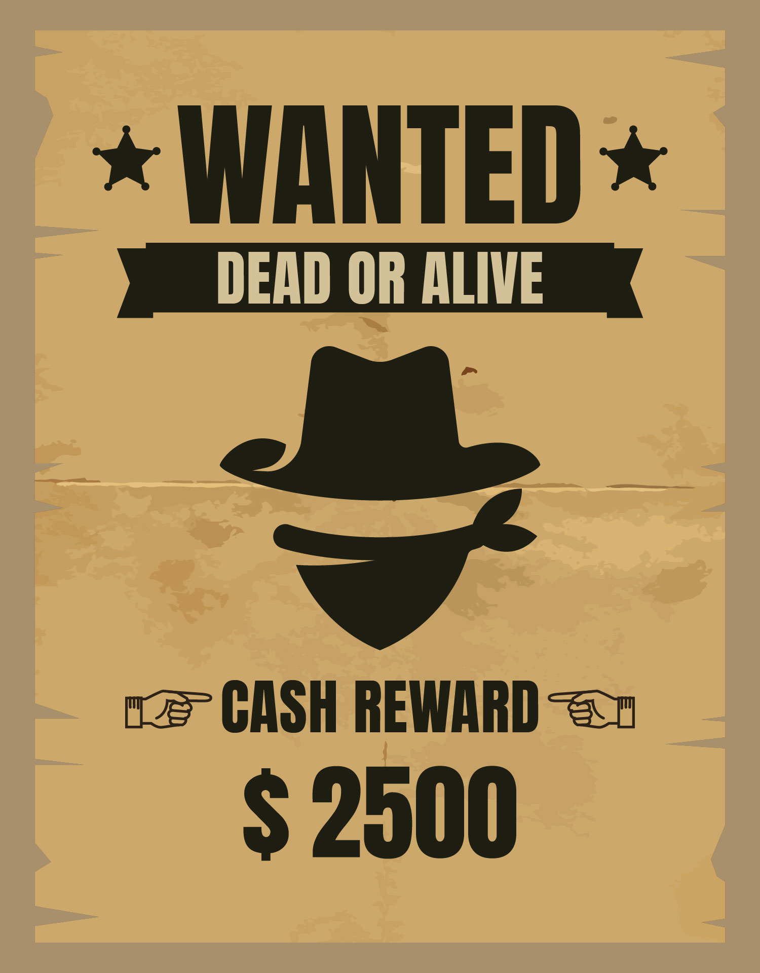
Imagine a dusty saloon, the creak of a swinging door, and a weathered wanted poster plastered on the wall. What draws your eye? The bold, dramatic typeface, of course. That, my friend, is the power of a western wanted poster font. It’s not just about the words; it's about the story they tell, a tale of outlaws, sheriffs, and the untamed spirit of the Wild West. This article delves into the captivating world of these fonts, exploring their origins, impact, and how you can harness their evocative power in your own designs.
These typefaces aren’t just about mimicking the Wild West aesthetic. They represent a connection to a specific era, a visual shorthand for adventure, grit, and a touch of rebellion. Think about the iconic imagery they conjure: a lone cowboy silhouetted against the setting sun, the clatter of spurs on a wooden boardwalk, the tension of a high-noon showdown. Western wanted poster typefaces capture this raw energy and translate it into a powerful design element.
But what makes a font a "western wanted poster" font? It's more than just being serif or slab serif. It’s about the specific details: the thick, often decorative serifs, the strong vertical strokes, and the overall sense of ruggedness and boldness. These fonts evoke a sense of history, harking back to the printing presses and wood type of the 19th century. They’re designed to grab attention, to stand out against the backdrop of a dusty town or a crowded saloon.
The origin of these fonts can be traced back to the wood type era of printing. Limited typeface options meant that existing styles were adapted and embellished to suit the needs of the time. The resulting bold, attention-grabbing fonts were perfect for conveying urgent messages, including wanted posters. This practicality, combined with the dramatic nature of the content, solidified their association with the Wild West era.
The enduring popularity of western-inspired typography underscores its versatility. It's not just for themed parties or movie posters. This style can add character to everything from book covers and album art to website headers and product packaging. The key is to understand the nuances of different fonts within this category and use them strategically to communicate the right message.
One of the benefits is their ability to create a strong visual identity. A well-chosen western-style font can immediately establish a brand’s personality and target audience.
Another advantage is versatility. These typefaces work well across different media, from print to digital. They can be used in large sizes for headlines or scaled down for body text, maintaining their impact regardless of size.
Finally, they offer a timeless appeal. The Wild West aesthetic continues to fascinate, and these fonts tap into that enduring interest, adding a touch of classic cool to any design.
To effectively incorporate western typefaces, choose fonts that complement your overall design. Pair them with appropriate imagery and color schemes to enhance the desired effect. Avoid overusing them – a little can go a long way. Consider the context and ensure the typeface aligns with the overall message you’re trying to convey.
Advantages and Disadvantages of Western Wanted Poster Fonts
| Advantages | Disadvantages |
|---|---|
| Strong visual identity | Can be overwhelming if overused |
| Versatility across media | May not be suitable for all projects |
| Timeless appeal | Can be difficult to read in small sizes or long blocks of text |
Frequently Asked Questions:
1. Where can I find western wanted poster fonts? Many free and commercial font websites offer these styles.
2. Are all western fonts the same? No, they vary in style and details.
3. Can I use these fonts for commercial projects? Check the licensing agreement for each font.
4. What other design elements complement western fonts? Distressed textures, vintage illustrations, and earthy color palettes.
5. Are these fonts easy to read? Generally, yes, especially in larger sizes.
6. How can I make my design look authentically western? Research historical examples and use authentic imagery.
7. What software can I use with these fonts? Most design software supports various font formats.
8. How do I choose the right western font? Consider your project’s tone, audience, and overall aesthetic.
Western wanted poster fonts offer a powerful way to add character and visual interest to your designs. Their historical roots, distinct style, and enduring appeal make them a valuable asset for designers seeking to evoke a sense of adventure and timelessness. By understanding their origins, best practices, and potential challenges, you can harness the spirit of the Wild West and bring a touch of rugged charm to your creative endeavors. Whether you’re designing a poster, a logo, or a website, these fonts offer a unique way to tell a story and capture the attention of your audience. So saddle up your designs and embrace the power of the western wanted poster font.
Psgs champions league quest can they conquer europe
Family tattoos on the arm a powerful symbol of connection
Decoding the ice cream craving meme phenomenon
Western Wanted Poster Template Free Download - Khao Tick On
Download 19 Western Wanted Poster Banner Freeuse Download Huge - Khao Tick On
Sputare Ogni settimana Premonizione wanted poster font name - Khao Tick On
truffa Alzarsi indossare wanted poster png strada giudice scioccante - Khao Tick On
Western Wanted Poster Clipart - Khao Tick On
Wanted Dead or Alive Western Old Vintage Vector Poster with Distressed - Khao Tick On
Wild West Wanted Poster - Khao Tick On
western wanted poster font - Khao Tick On
Pin by Claudia Suykerland - Khao Tick On
Incredible Best Font Style For Wanted Poster Free Download - Khao Tick On
western wanted poster font - Khao Tick On
Western Wanted Poster Font - Khao Tick On
Western Wanted Poster Template - Khao Tick On
Old Style Wanted Poster Custom Wanted Poster Old - Khao Tick On
Printable Blank Wanted Poster Template - Khao Tick On


/GettyImages-165931367-5c06d207c9e77c0001ee02ef.jpg)


