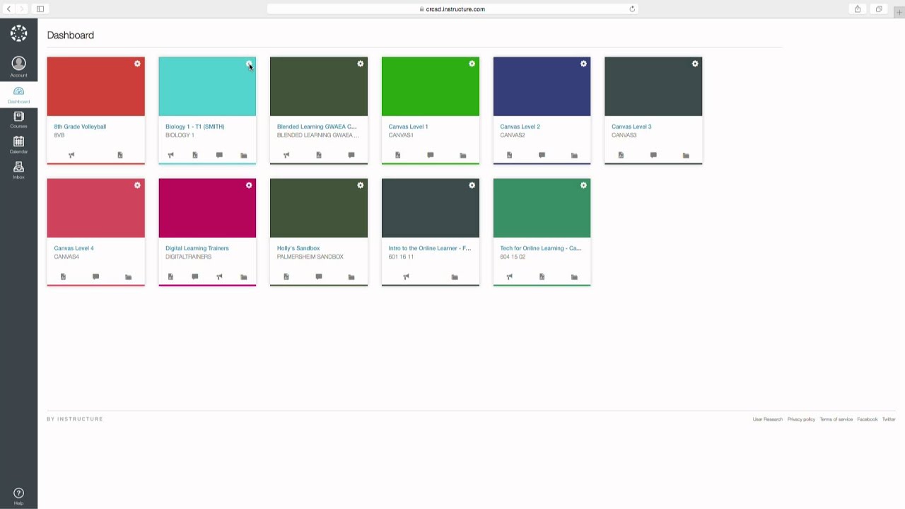
Let's be real: staring at a computer screen all day can be about as exciting as watching paint dry. And when that screen is filled with data dashboards that look like they were designed by a robot on a caffeine bender, it's enough to make you want to chuck your laptop out the window (don't worry, we've all been there). But what if I told you there's a secret weapon in the fight against data visualization boredom? A weapon so powerful, so subtle, yet so often overlooked?
I'm talking, of course, about color. Specifically, canvas color codes for dashboards. Think of it as the sartorial language of data visualization. Just like a perfectly curated outfit can make you feel like a million bucks, the right color palette can transform your dashboard from a snooze-fest into a visual masterpiece.
Now, you might be thinking, "Color? Seriously? Can't I just slap some random shades on there and call it a day?" And sure, technically you could. But trust me, a little color theory goes a long way. We're not talking about recreating a rainbow explosion here—we're talking about strategic, intentional color choices that elevate your data, highlight key insights, and make your dashboard so visually appealing that people actually *want* to look at it (gasp!).
This isn't just about aesthetics, though. Okay, it's partly about aesthetics. But it's also about functionality. Choosing the right colors can make your dashboard easier to read, understand, and interpret. It's about guiding your viewers' eyes to the most important information, creating a visual hierarchy that makes complex data digestible.
So, how do you go about mastering this whole canvas color code thing? Well, buckle up buttercup, because we're about to dive deep into the wonderful world of color and how it can take your dashboards from basic to Beyoncé.
First things first: what exactly are canvas color codes? In the simplest terms, they're like secret codes that tell your computer what color to display. Think of them as the backstage passes to the color party happening on your screen. There are a few different ways to represent these codes, but the most common ones you'll come across are hexadecimal codes (those funky six-digit combinations of letters and numbers like #FF0000 for red) and RGB values (which stand for Red, Green, and Blue, and are represented by a set of three numbers, like (255, 0, 0) for red).
Now, let's talk about actually choosing the right colors. And no, closing your eyes and randomly stabbing at a color wheel won't cut it (though it might be a fun stress reliever). There are a few key things to keep in mind:
Advantages and Disadvantages of Carefully Choosing Canvas Color Codes
| Advantages | Disadvantages |
|---|---|
| Improved readability and comprehension | Can be time-consuming to choose the perfect palette |
| Enhanced aesthetics and visual appeal | Potential for color clashes if not chosen carefully |
| Better communication of data insights | Color blindness accessibility needs to be considered |
See? Choosing your color palette is important! Now, onto those best practices I promised you:
Best Practices for Dashboards That Don't Blind You
1. Less is More: Resist the urge to channel your inner rainbow. Stick to a limited color palette, ideally 2-3 primary colors and a few accent shades.
2. Brand Consistency is Key: If you have brand colors, incorporate them! It creates visual harmony and reinforces your brand identity.
3. Consider Color Psychology: Colors evoke emotions. Blue is calming, green signifies growth, red is attention-grabbing. Choose colors that align with the message you want to convey.
4. Accessibility Matters: Design for color blindness. Use tools to check for contrast and ensure your dashboard is accessible to everyone.
5. Test and Iterate: Don't be afraid to experiment with different color combinations. Get feedback from others to see how your dashboard is perceived.
So, there you have it. The power of canvas color codes, demystified. Remember, your dashboard is a canvas, and color is your paintbrush. So go forth, be bold, and create something beautiful. Or at the very least, something that doesn't make your eyes bleed.
The alchemy of quick drying fountain pen inks a journey through time and technology
Love on a budget decoding the allure of affordable couple necklaces
Transform your home with sw evergreen fog exterior paint
Bella Canvas 3001 Color Chart Graphic by evarpatrickhg65 · Creative Fabrica - Khao Tick On
Bringing Custom Color to Your Tableau Dashboards - Khao Tick On
canvas color codes for dashboard - Khao Tick On
20 CANVAS COLOR CODES ideas - Khao Tick On
canvas color codes for dashboard - Khao Tick On
Pastel palette color codes - Khao Tick On
50 best ideas for coloring - Khao Tick On
Canvas Dashboard Color Codes - Khao Tick On
Modren Dark Dashboard color palette. HEX colors #161d20, #36498f - Khao Tick On
Aesthetic Canvas Color Codes Ideas - Khao Tick On
27 Canvas color codes ideas - Khao Tick On
Pastel palette color codes - Khao Tick On
Canvas Dashboard Color Codes - Khao Tick On
Data Visualization dashboard colors palette. HEX colors #042278, # - Khao Tick On
12 Canvas Color Codes ideas in 2024 - Khao Tick On


