Ever feel overwhelmed by a massive spreadsheet and struggle to extract meaningful insights? Imagine having the power to effortlessly slice and dice your data, visualizing different perspectives in seconds. This is the power of creating multiple pivot charts from a single data table – a skill that can transform how you analyze information and make data-driven decisions.
Generating several pivot charts from one dataset allows you to explore various facets of your data without manually creating separate tables. This saves time, reduces redundancy, and ensures consistency in your analysis. Whether you’re tracking sales performance, analyzing website traffic, or monitoring project progress, leveraging this technique provides a comprehensive view, uncovering hidden trends and patterns that might otherwise be missed.
The concept of pivot tables, the foundation for pivot charts, dates back to the early 1990s. Pivoting data initially involved complex manual calculations. However, with the advent of spreadsheet software like Microsoft Excel, Lotus 1-2-3, and later, Google Sheets, the process became significantly streamlined. These tools automated the creation of pivot tables, making data analysis accessible to a wider audience. The subsequent introduction of pivot charts further enhanced data visualization, enabling users to graphically represent the summarized data from their pivot tables.
The primary challenge associated with generating numerous pivot charts from the same table lies in ensuring data integrity and avoiding misinterpretations. If the source data is inaccurate or inconsistent, the resulting charts will be flawed. Therefore, it’s crucial to begin with clean, validated data. Another potential issue is creating too many charts, leading to information overload. Focus on crafting charts that address specific questions and provide clear, actionable insights.
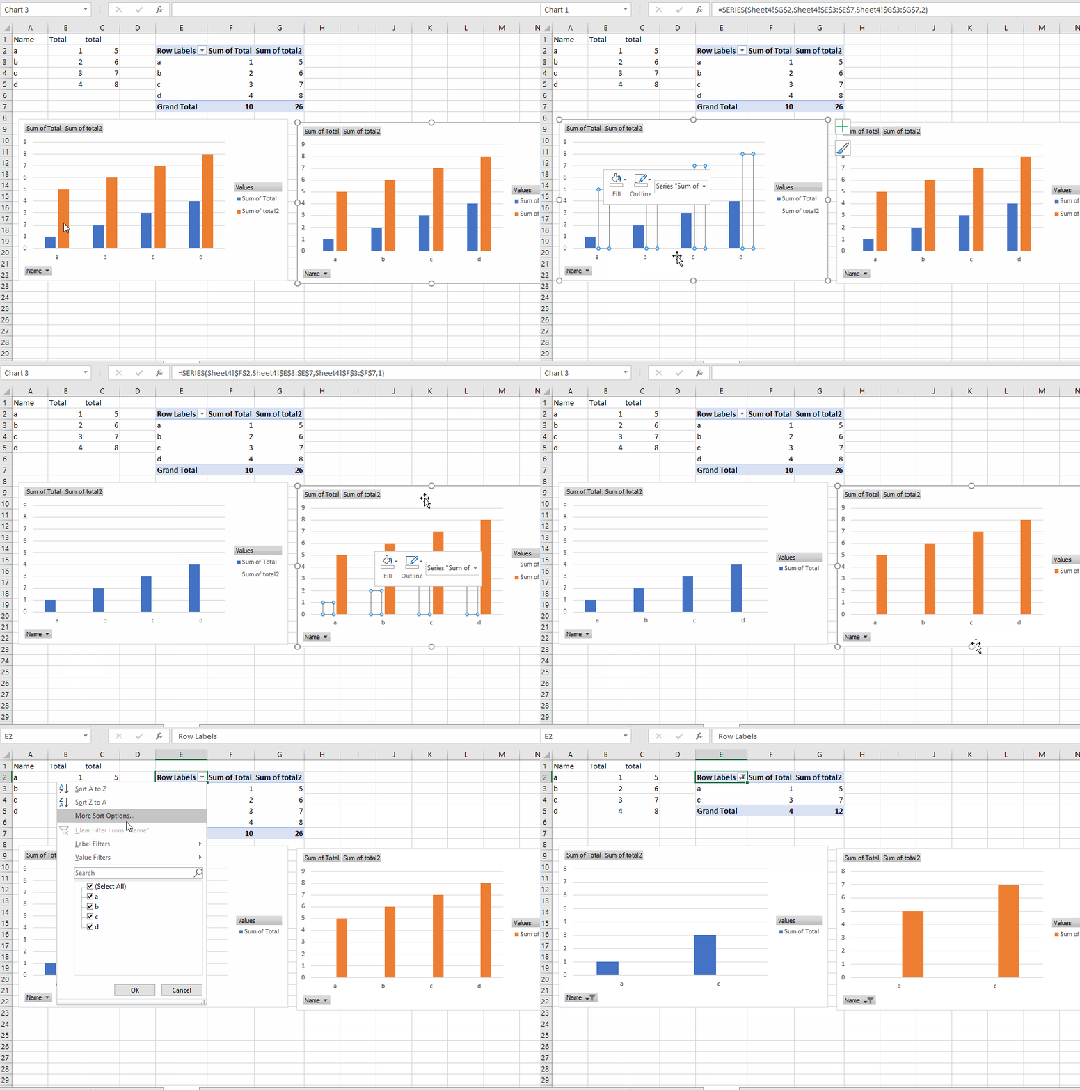
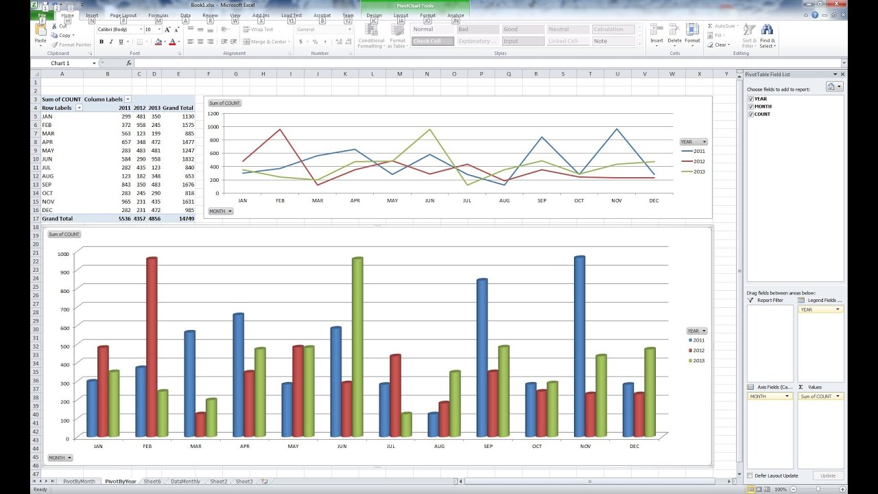
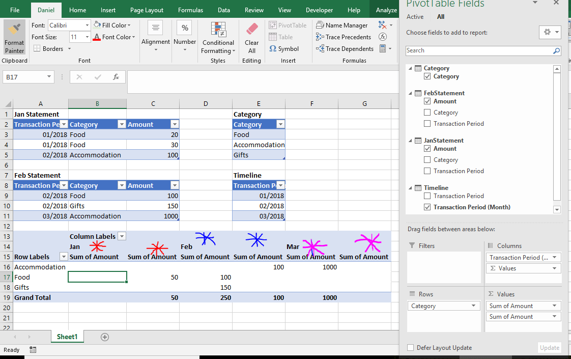
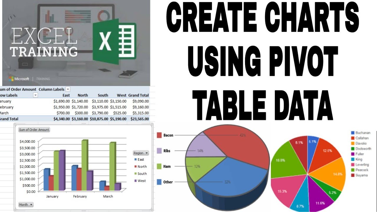
A pivot table is a data summarization tool that allows you to reorganize and aggregate data from a larger dataset. A pivot chart, in turn, visually represents the data within a pivot table. For instance, imagine a table containing sales data with columns for product, region, sales amount, and date. You could create one pivot chart showing sales by product, another showing sales by region, and a third showing sales trends over time – all derived from the same original table.
One of the key benefits of deriving multiple pivot charts from a single table is enhanced data exploration. By quickly switching between different views, you can gain a deeper understanding of the relationships within your data. Another advantage is improved communication. Visualizations make it easier to convey complex information to others, facilitating better decision-making. Furthermore, consistency is maintained. By basing all your pivot charts on the same source data, you ensure that all your analyses are aligned and accurate.
To effectively produce multiple pivot charts from a single table, start by identifying the key questions you want to answer. Then, select the relevant data fields for each chart. Ensure your data is clean and accurate before creating your pivot tables and corresponding charts. Finally, carefully label and format your charts to enhance readability and clarity.
For Excel, consider the "PivotTable and PivotChart Wizard" for guided creation. Online resources and Excel tutorials provide valuable learning materials. Books like "Excel 2023 Bible" by Michael Alexander offer comprehensive guidance. For Google Sheets, explore the built-in pivot table and chart functionalities. Online forums and Google's help center provide helpful resources.
Advantages and Disadvantages
| Advantages | Disadvantages |
|---|---|
| Efficient Data Exploration | Potential for Misinterpretation if data is incorrect |
| Improved Communication | Can be overwhelming if too many charts are created |
| Data Consistency | Requires some initial learning curve |
Best Practices:
1. Start with Clean Data
2. Define Specific Questions
3. Choose Appropriate Chart Types
4. Use Clear Labels and Titles
5. Focus on Key Insights
Real Examples: Sales analysis by region, product performance over time, website traffic sources, marketing campaign effectiveness, customer demographics.
Challenges and Solutions: Data cleaning, handling large datasets, choosing appropriate chart types, interpreting results, communicating findings.
FAQs: What is a pivot table? How do I create a pivot chart? What are the different chart types available? How do I filter data in a pivot chart? How do I format a pivot chart? What are calculated fields? How do I share pivot charts? How do I refresh pivot chart data?
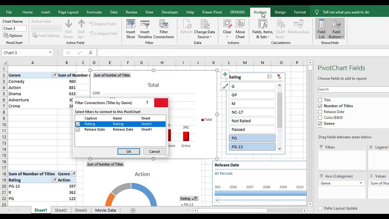
Tips and Tricks: Experiment with different chart types, use slicers for interactive filtering, explore calculated fields for custom calculations, format charts for maximum impact.
In conclusion, the ability to derive multiple pivot charts from a single data table is a powerful tool for anyone working with data. It allows for efficient data exploration, improved communication, and ensures consistency in analysis. By following best practices and addressing potential challenges, you can unlock the full potential of your data and gain valuable insights that drive informed decision-making. Mastering this technique empowers you to effectively visualize and analyze information, transforming data into actionable knowledge. Start exploring your data today and discover the hidden stories waiting to be told. Invest time in learning and practicing this invaluable skill; it's an investment that will pay dividends in your ability to make data-driven decisions and achieve your goals. So, dive in, experiment, and unlock the power of data visualization.
Kota kemuning new development a growing township in malaysia
Unlocking trust what does it take to become a notary in texas
Cuanto dura un perro embarazada a comprehensive guide
How To Combine Multiple Pivot Tables Into One Graph - Khao Tick On
make multiple pivot charts from one table - Khao Tick On
How To Combine Months In A Pivot Table - Khao Tick On
make multiple pivot charts from one table - Khao Tick On
Multiple Pivot Charts From One Pivot Table - Khao Tick On
Pivot Table In Excel Not Showing All Data at Randy Martinez blog - Khao Tick On
How To Combine Data From Two Tables In Excel at Adina Campbell blog - Khao Tick On
Use Pivot Table To Compare Two Worksheets at Mary McMahan blog - Khao Tick On
How To Protect Sheet With Pivot Table at Bruce Clark blog - Khao Tick On
Excel pivot chart combinging tables - Khao Tick On
Multiple Pivot Charts From One Pivot Table - Khao Tick On
Microsoft Excel How To Make Multiple Pivot Charts From One Pivot Table - Khao Tick On
How To Use Columns In Pivot Table - Khao Tick On
Pivot Chart Data Table Number Format at Amanda Rickard blog - Khao Tick On
Create Pivot Table From 2 Worksheets Excel 2010 - Khao Tick On

